Data visualisation for the carbon removal industry
TRACEcdr
The Brief
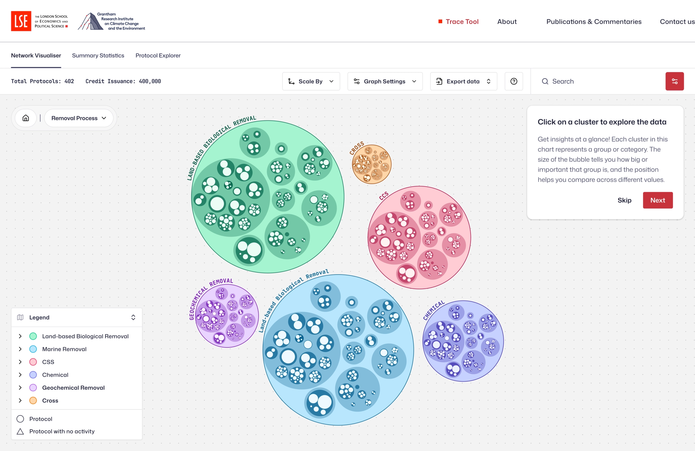
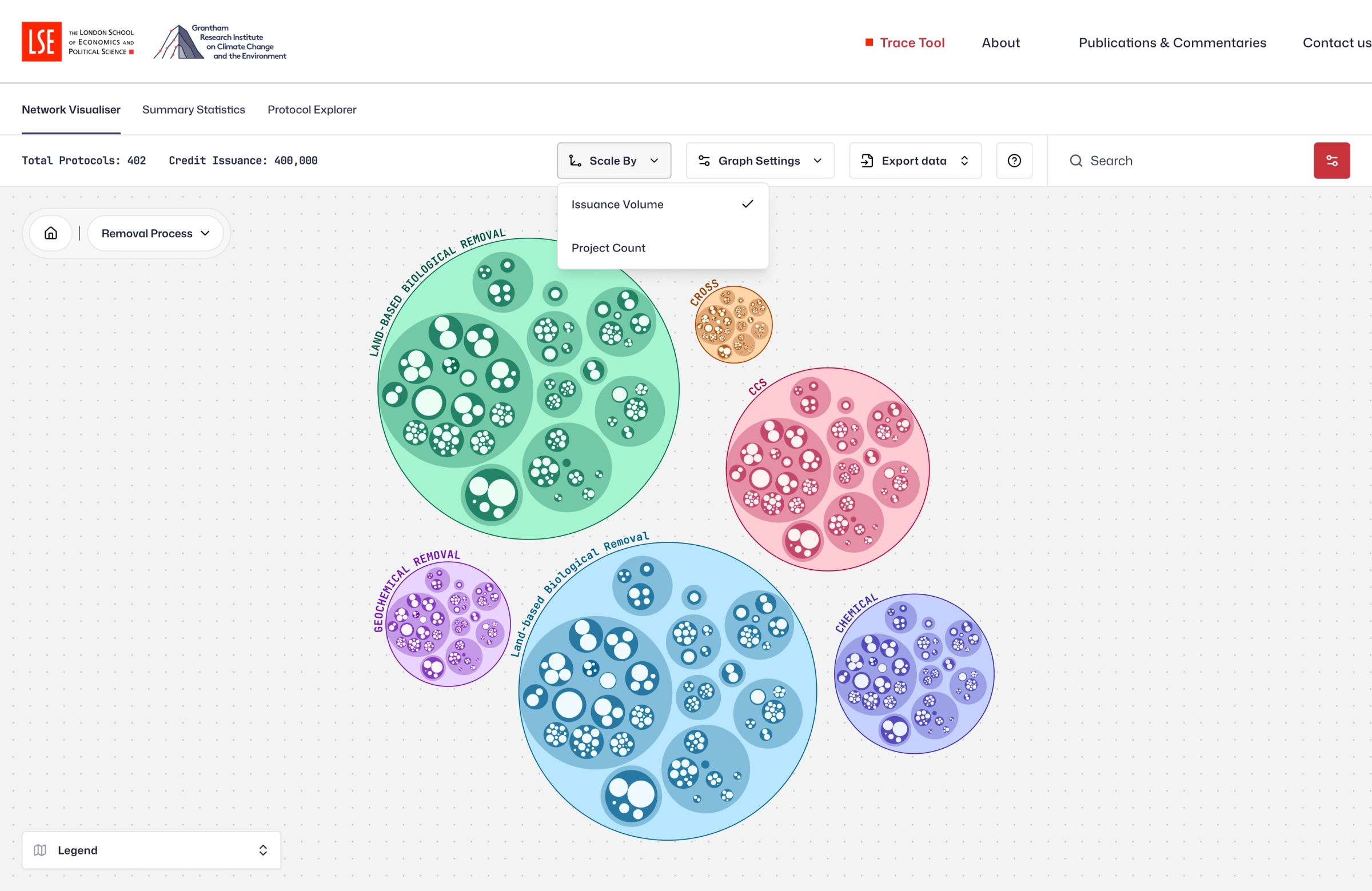
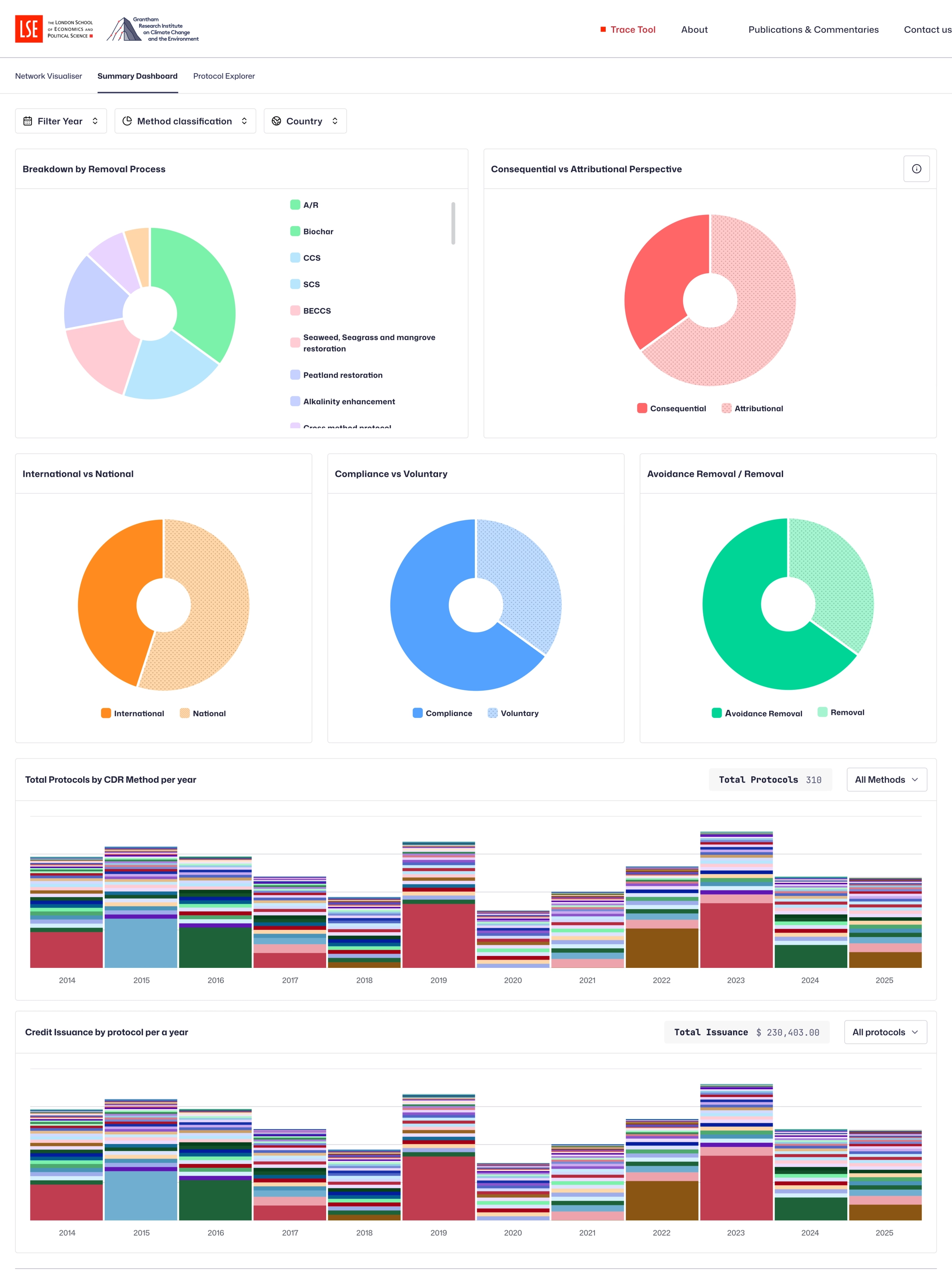
TRACEcdr (Transparent Reporting and Certification for CDR) is an interactive data visualisation tool co-developed by the Grantham Research Institute at LSE and AlliedOffsets. It maps the carbon dioxide removal (CDR) ecosystem across four layers:
- Layer 1 - CDR methods (afforestation, DACCS, BECCS, etc.)
- Layer 2 - Standards bodies and entities behind the protocols
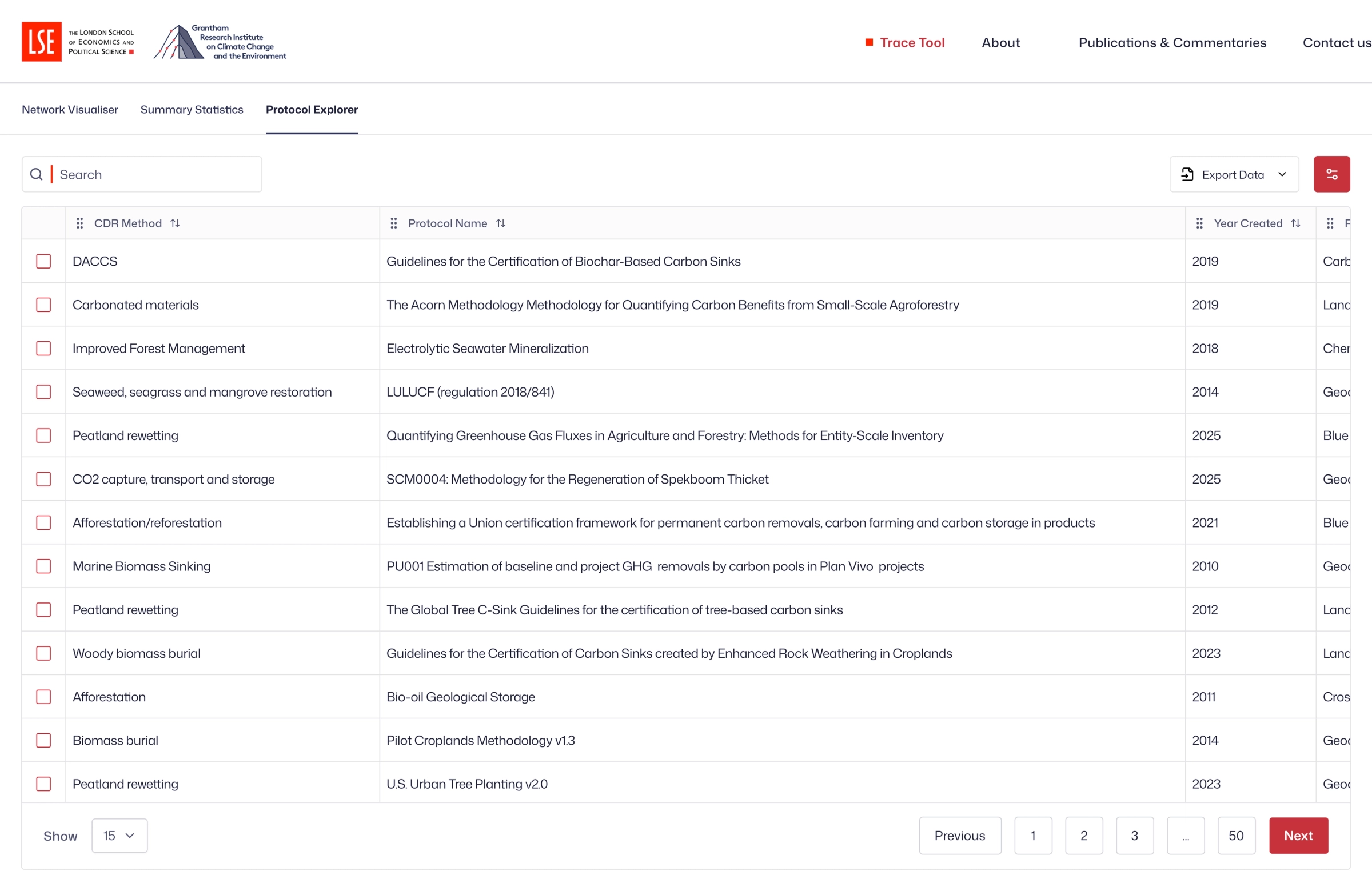
- Layer 3 - Specific MRV (Monitoring, Reporting, Verification) protocols, tagged by scope
- Layer 4 - Individual projects with issued credit volumes, where node size represents scale
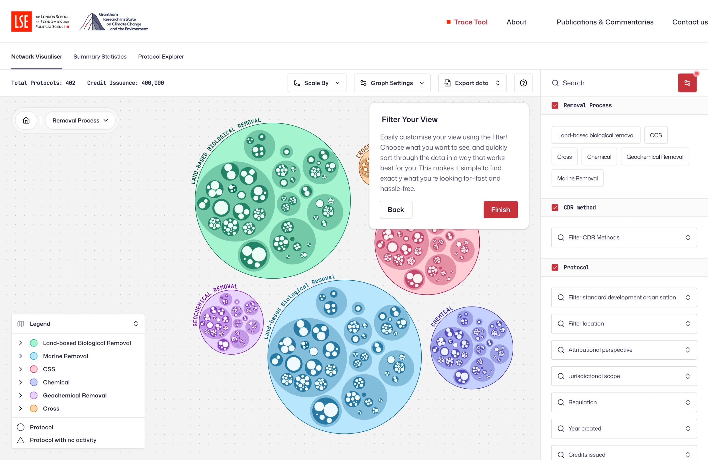
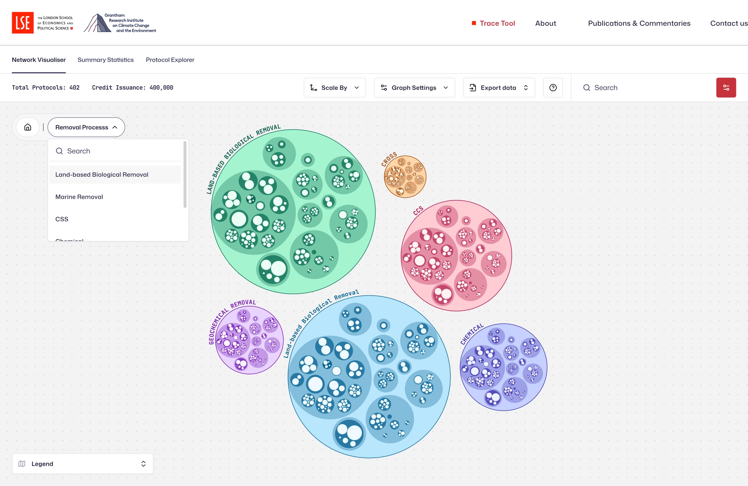
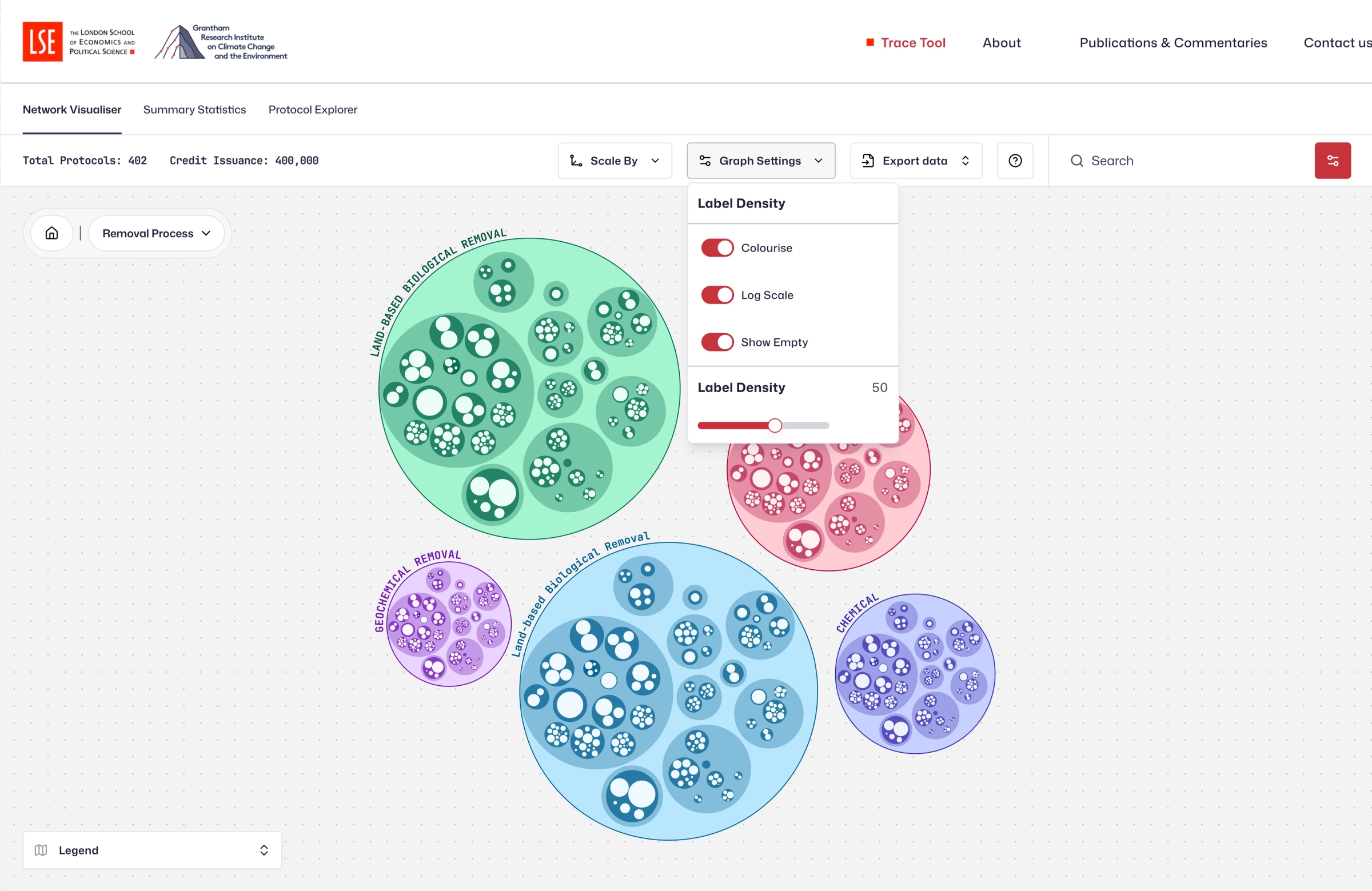
Users can filter by MRV type, market type, or method, and drill through the layers to explore relationships between protocol design, credit issuance, and market participation.
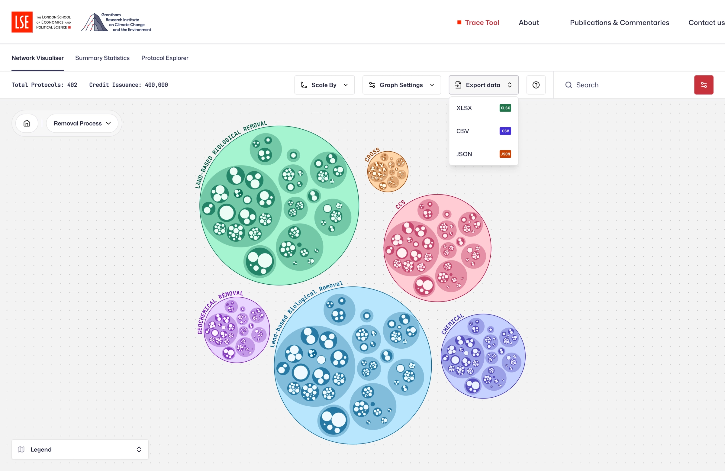
The goal was to add new analytical capabilities, improve the visualisation, and design a dedicated website to house the tool.
Shifting the hubris
Every other visualiser in the CDR space used the same approach: tree diagrams.
Messy, sprawling, non-adaptive tree diagrams. Nodes scattered everywhere. Lines crossing each other. Zooming in meant losing context. Zooming out meant losing detail.
The original TRACEcdr tool was no exception. It used React Flow, and the nodes were not adaptive. The layout was rigid. Points were all over the place. It worked in the sense that the data was technically there, but it did not invite exploration. It did not make you want to understand the CDR ecosystem. It made you want to close the tab.
The challenge was not just making it prettier. I had to find a completely different way to represent the data, one that had not been used in this industry before - and making it intuitive enough that a policymaker, a researcher, and a carbon credit buyer could all use it without instruction.
Think Petri Dish