The Art of Working With What You Are Given
Berty Bear
The Brief
Berty Bear is a smart nursery device and companion mobile app designed to help parents connect with each other without having a phone in the room.
The physical product is a bedside unit featuring a nightlight, white noise generator, breastfeeding timer, and an alert button that lets a child signal for attention from elsewhere in the home. The mobile app acts as the parent's interface to the device: receiving alerts, controlling the nightlight and sound settings, and managing feeding sessions.
The device and the app had to feel like one coherent product, even though they were being built on separate timelines and by separate teams.
Now for the hard part
Tight budget. Small window of execution. And the collateral we received from the client was, well, limited:
The client's wife created the brand guidelines, bless her soul. Jokes aside, it's pretty good and would probably suffice for a fun marketing website, but for an app, it's not quite there.
Contrast
Now I know what you're thinking, and you're probably right.
In a vacuum, fixing the contrast would have been straightforward. However, we were not working in a vacuum. We were up against a deadline and a budget, and we had a client who had already "approved" the brand work.
I was exaggerating in the illustration above but I had to make a point, the colours weren't great for a mobile app.
I did the maths, there are 49 colour combinations.
Guess how many were at the very least AA compliant?
Four.
Contrast matters for any app. For a nursery device used by potentially sleep-deprived parents, it matters even more. Low contrast means squinting. Squinting means frustration.
Frustration means the product goes in the drawer and never comes out.
The colours and assets that could work on a marketing site just didn't translate to a mobile interface. So the real problem became: how do you take what you're given and make it sing in a completely different medium, on a tight timeline?
A Way Forward
I had to get creative.
A vision struck me, one of long johns, baby powder and night lights. What if I "burnt" the colours? "Toasted" them ever so slightly. Hmm, cozy. I could still have all the hues present from the brand guide they would just be, darker.
Could I pull it off? Could I get away with it?
Back to the drawing board
His wife had worked really hard on the brand, and I had to respect that. Consequently, the toast was off the table and I returned to the original palette.
Show the Mess to Sell the Masterpiece
I had to show the client what I was speaking about. Too many colours fighting for attention is hard to pull off. His thinking was that, as this was an app for infant care, it should be infantile. But, that's where he was wrong. It was not an app for infants, but for parents and caretakers.
He had an idea in his head and it included all of the colours in the brand, sprayed everywhere, like a toddler with a new set of crayolas before a blank wall that seemed to beg them to recreate their interpretation of the Sistine Chapel ceiling frescoes on its newly painted surface.
But this is just is not good design, especially considering the target users.
We had to show the client the anti-pattern.
This approach works really well, and after this project I believe it more than ever. Yes, it takes more time and is essentially throwaway work, but it allowed the client to understand things from a product designer's perspective.
The headings aren't legible, the colours are fighting for attention, it's difficult to tell what's going on.
The client agreed. Noice
It was obvious, we need to tone down the colours and use them wisely if we're sticking to the original palette.
So which colours?
It had to be androgynous. Simple as that. Broad appeal means selling to as many parents as possible, and the colour is one of the first signals a parent reads when they see the product.
More progressive parents would not care what colour is used. If it solved a problem, they would buy it. But for everyone else, the colour sends a signal. So the goal was not to pick a "neutral" that pleases nobody. It was to pick one that works for everyone without forcing anyone to have an opinion about it.
The client had mentioned early on that he liked the brown and yellow tones. Bears and honey. That comment had stuck with me, even if we hadn't yet figured out how to make them work in an app.
Enter honeycomb hues
Aptly named so the client could get on board and hopefully see the vision.
It worked, and the ball got rolling.
Snail Mail
I received a prototype of the Berty Bear device in the mail.
That's a cute face, I thought. The wheels started turning... let's lean into it.
We could convey so much emotion if we wanted to in future releases: a sad face on an error, happy on success. The bear could become the mascot that carried the app.
The app's personality started to open up.
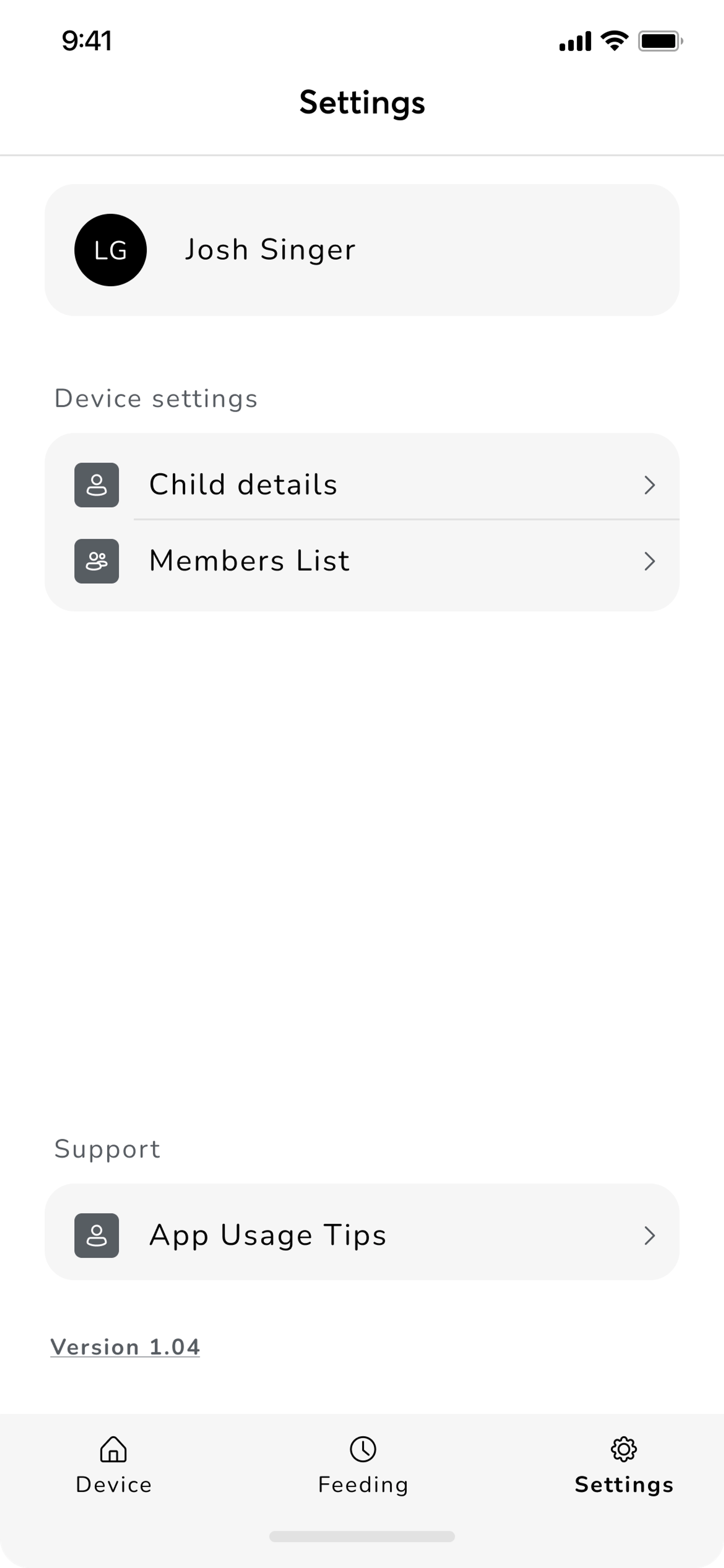
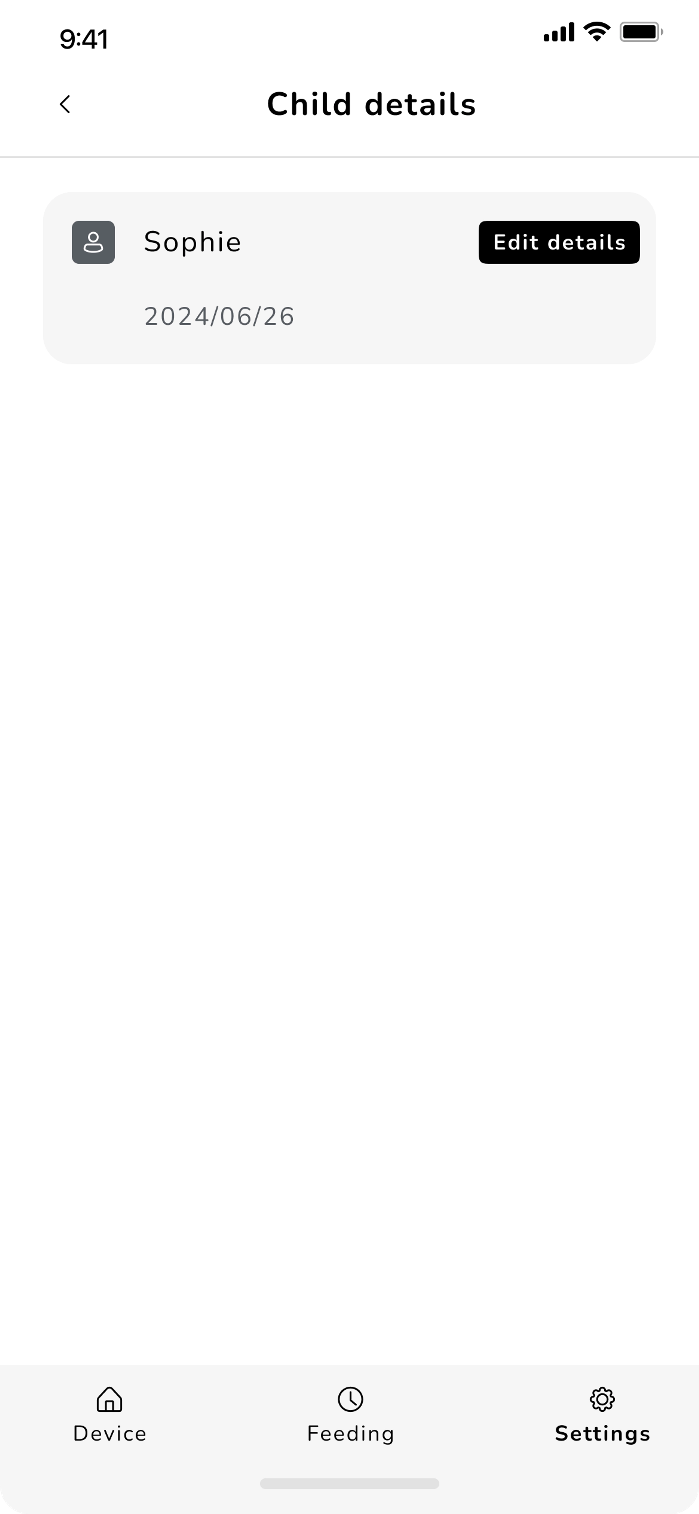
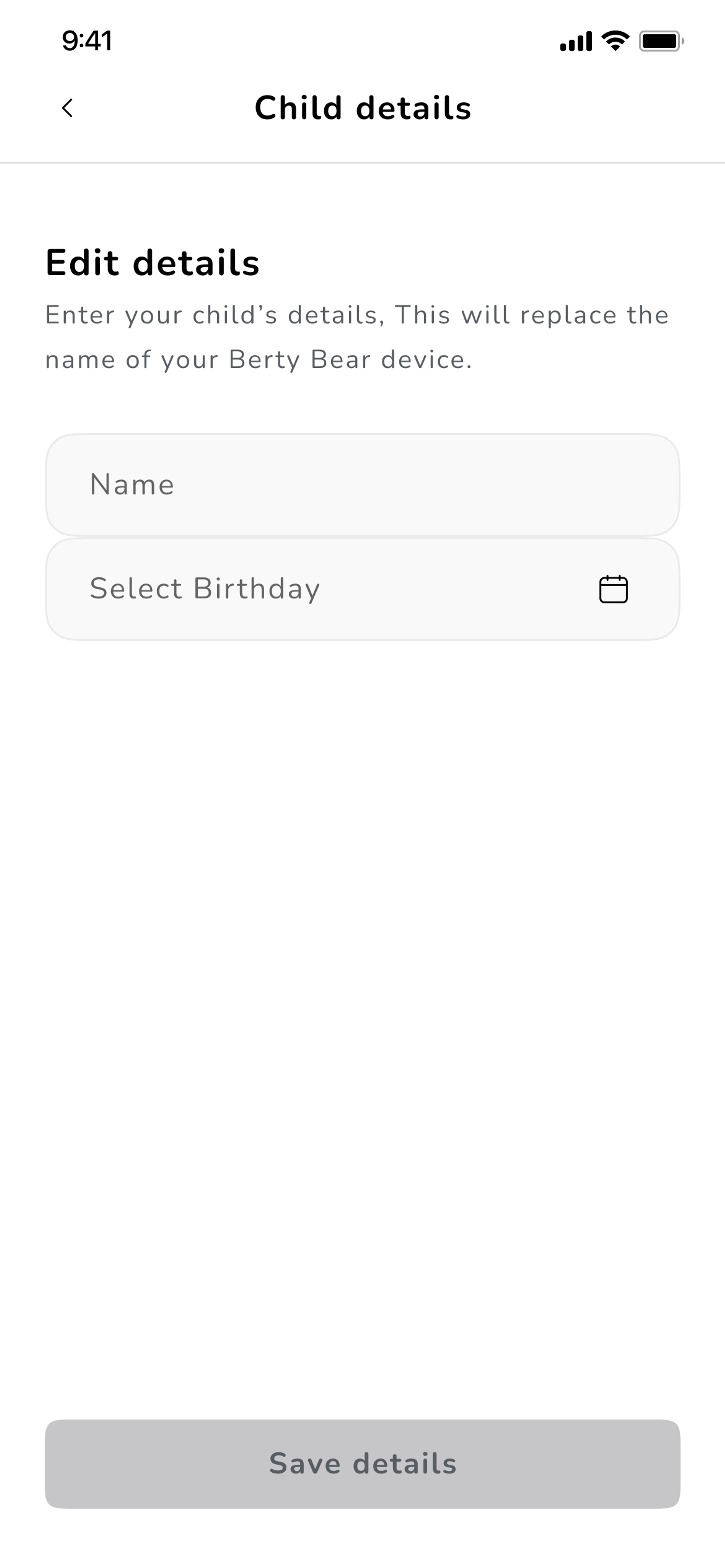
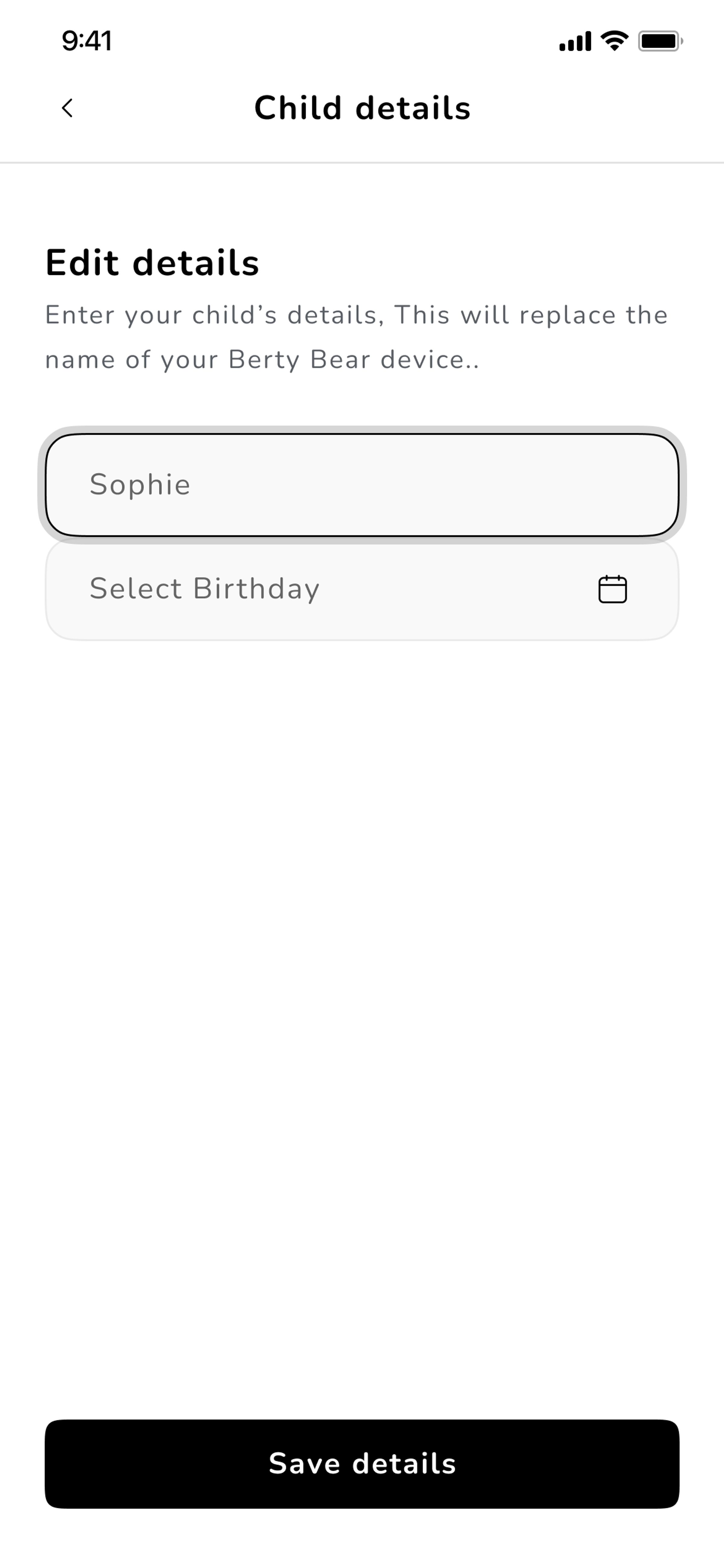
A look at some wireframes
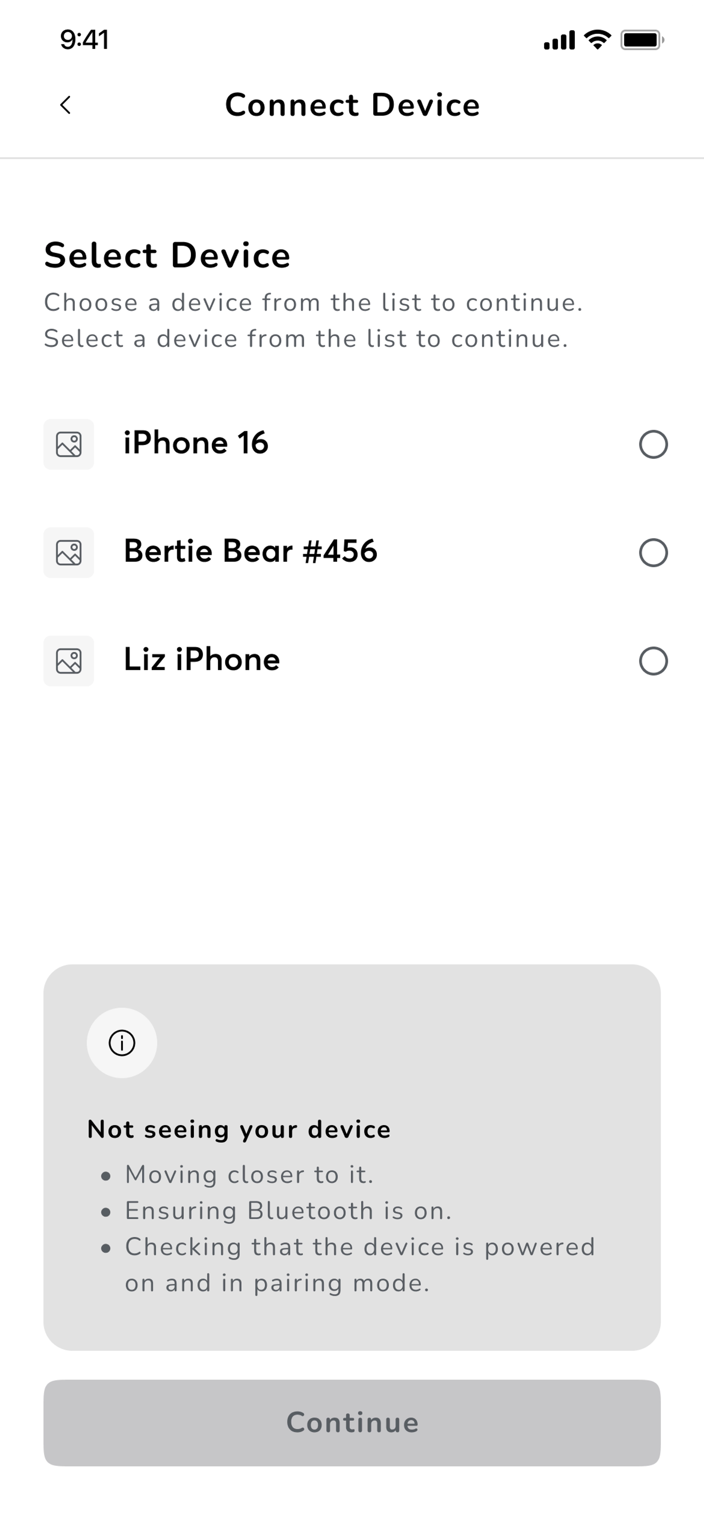
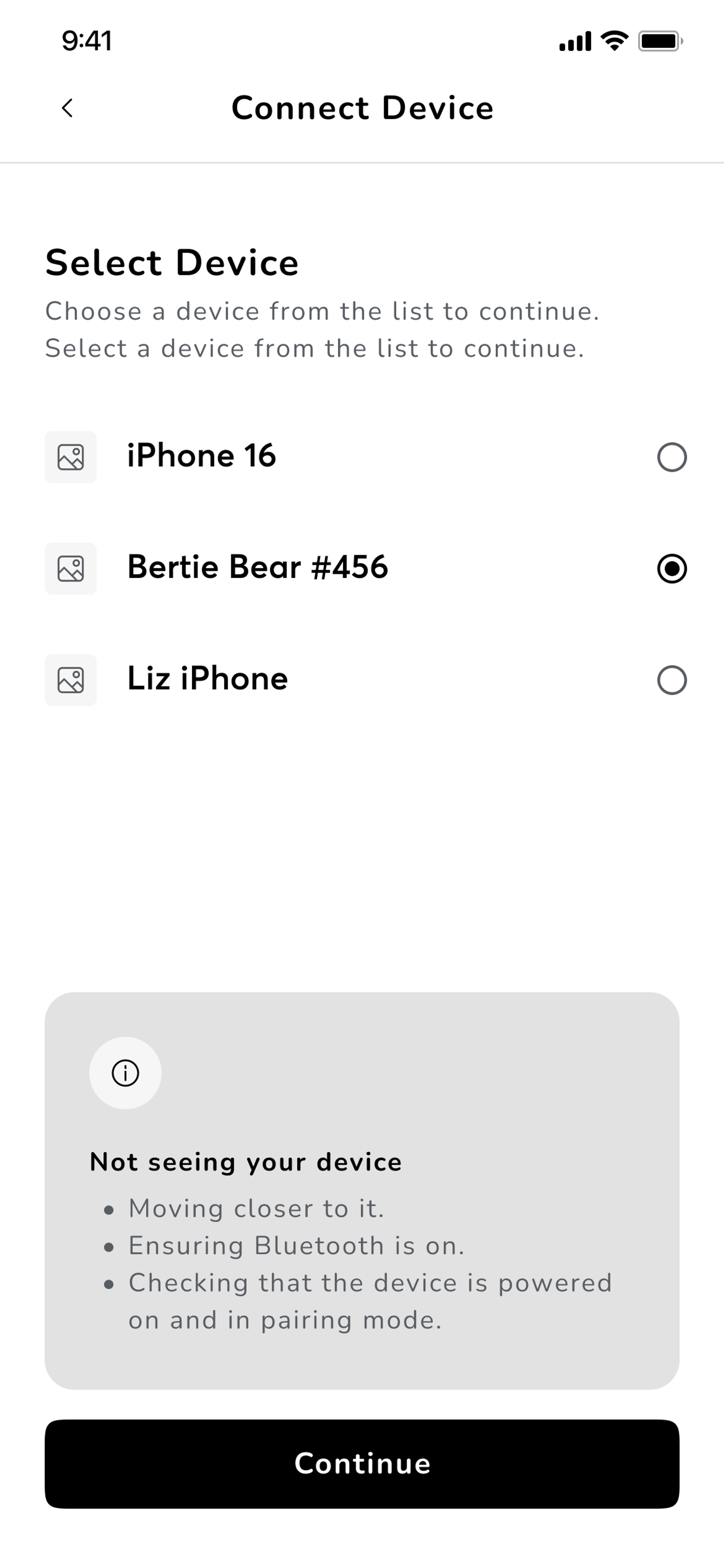
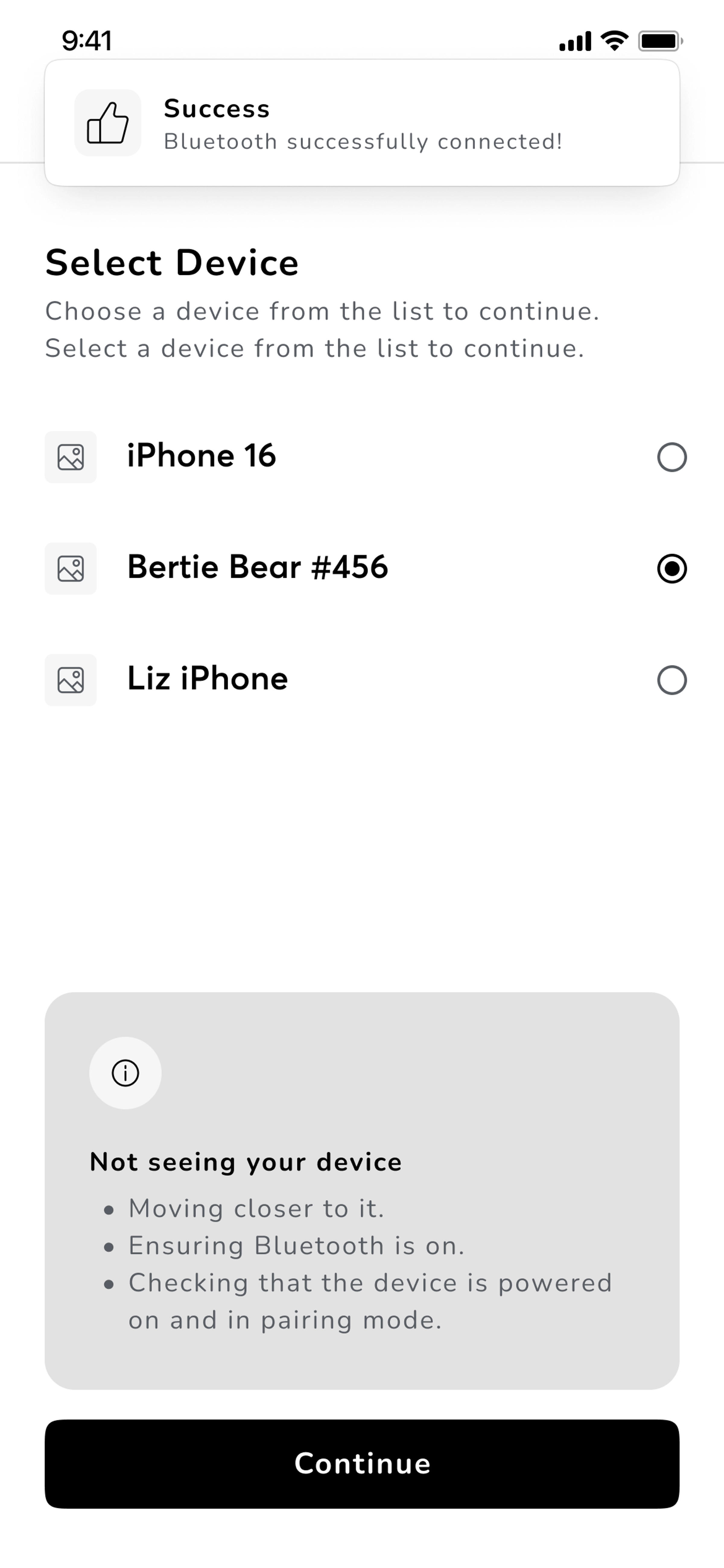
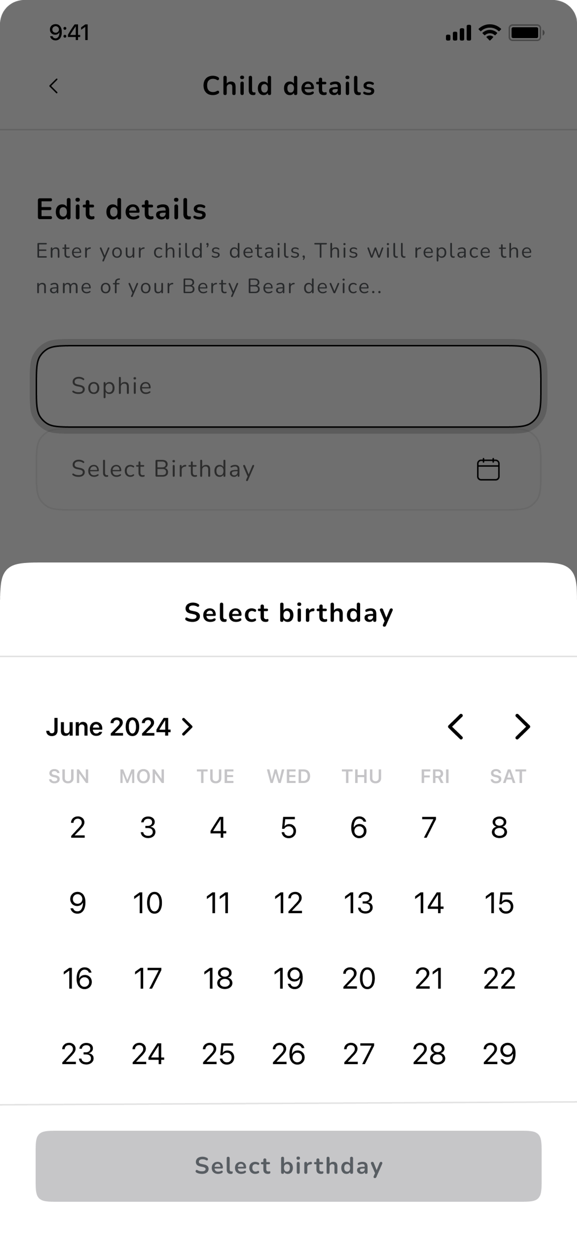
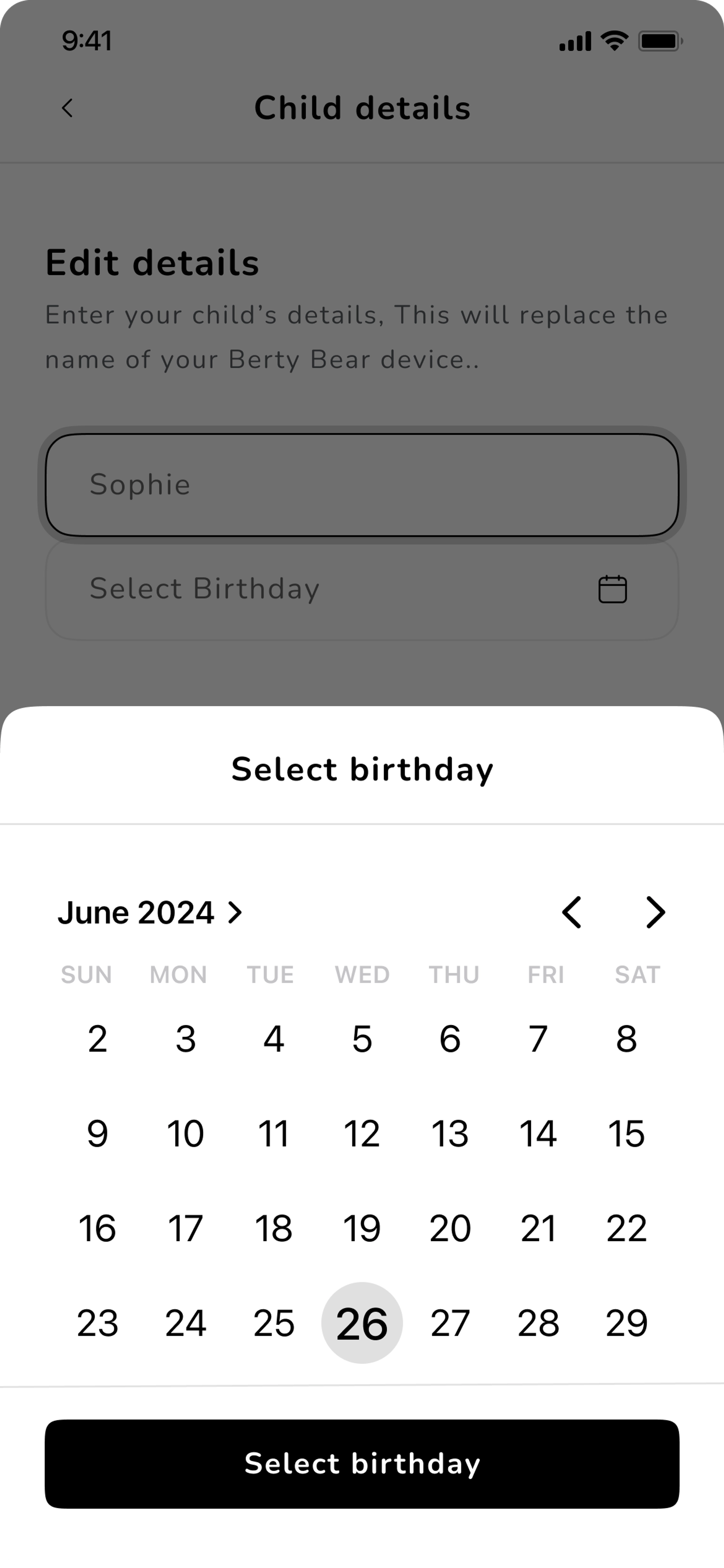
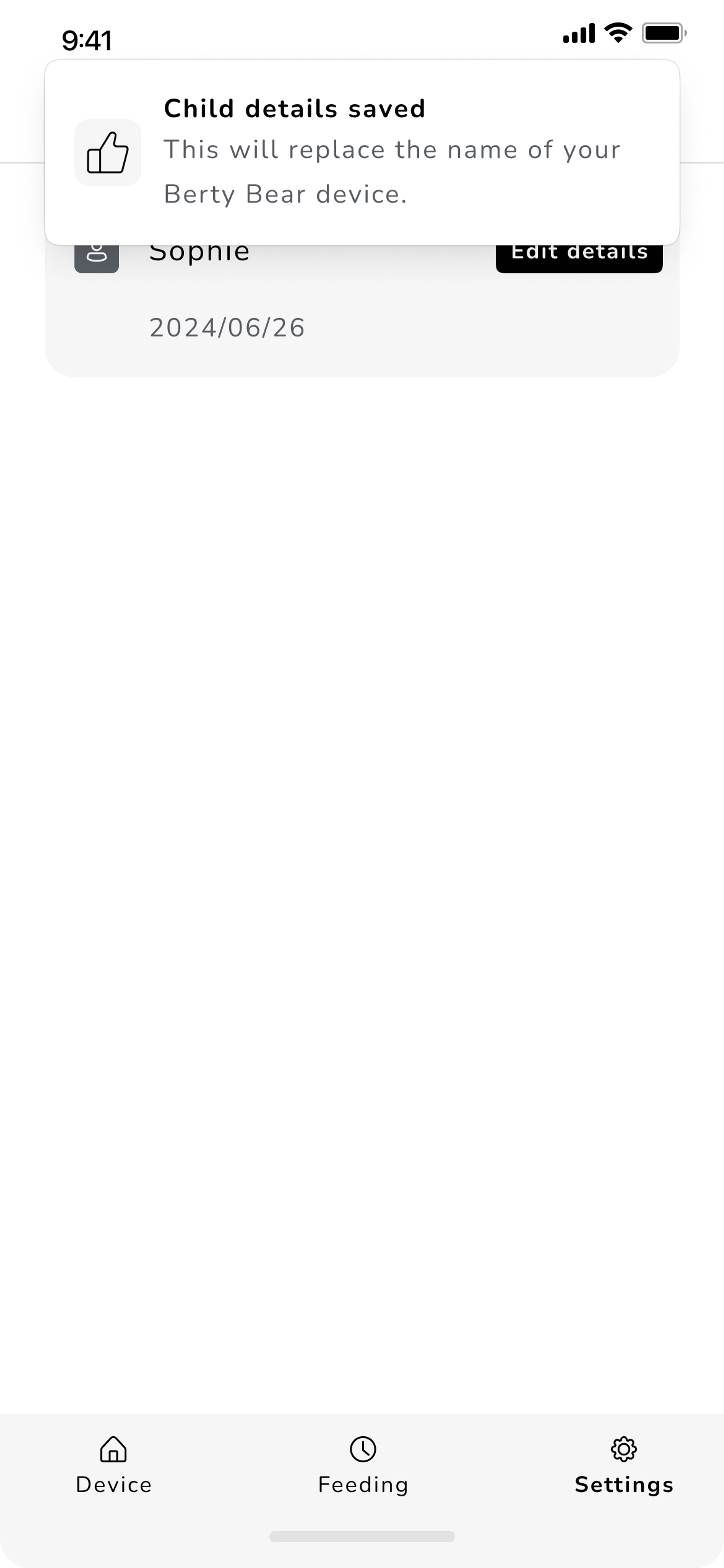
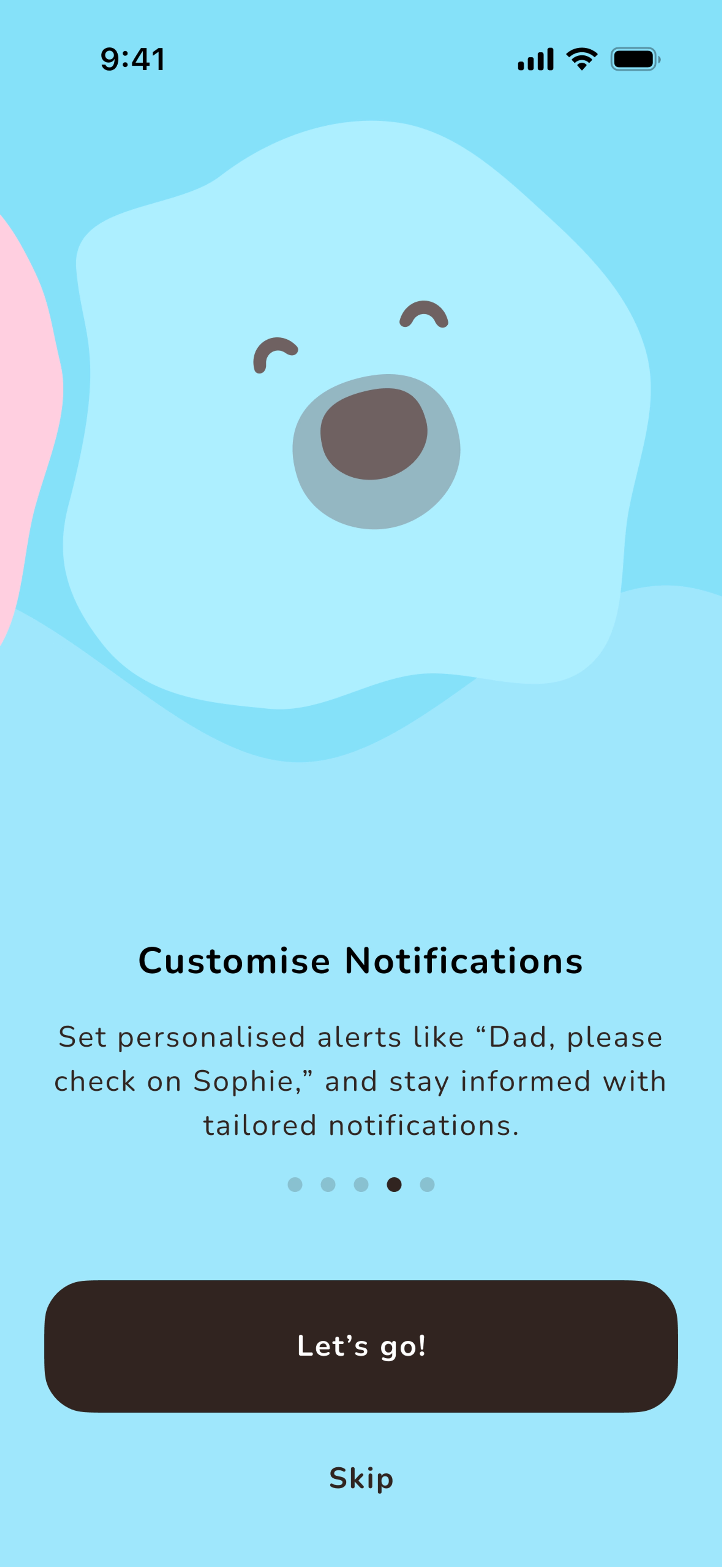
A few high-fidelity designs

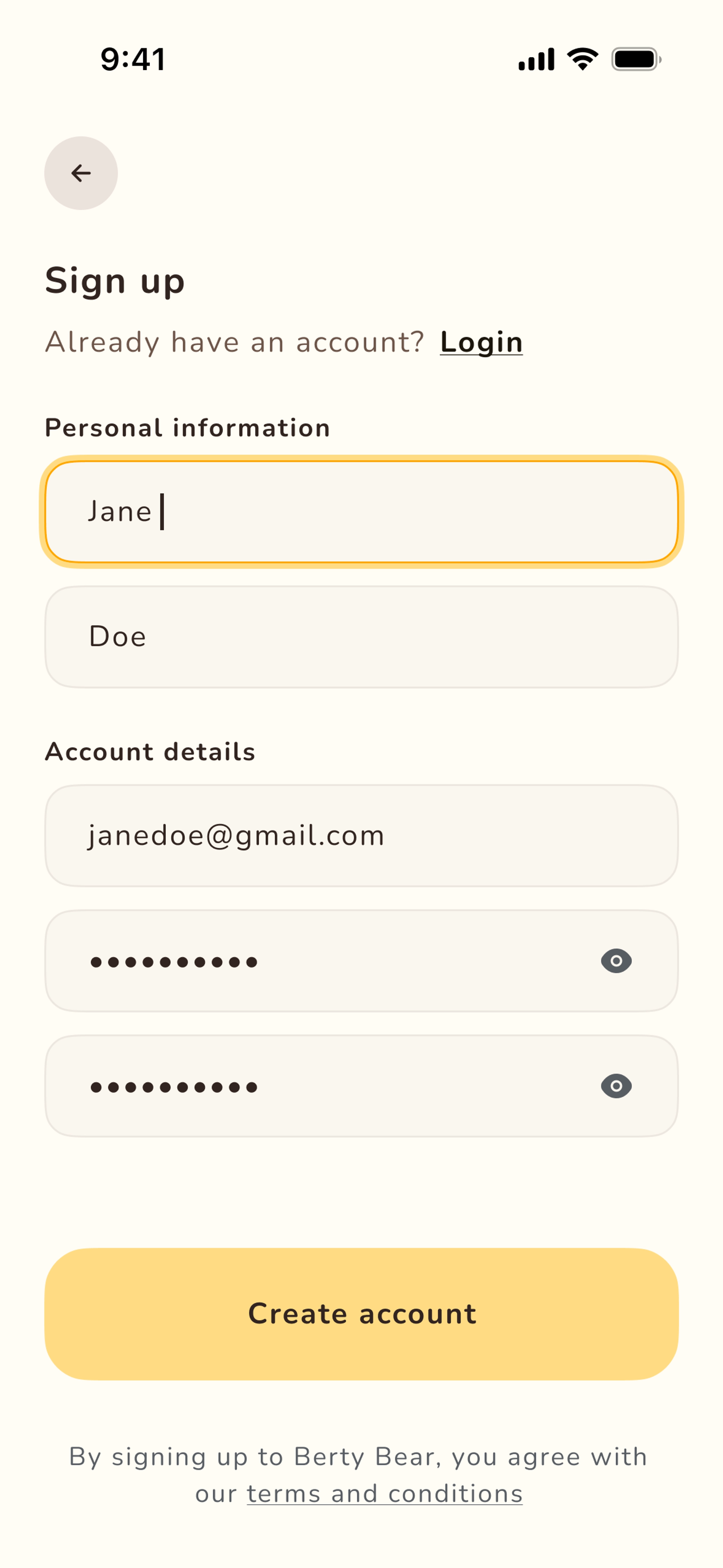
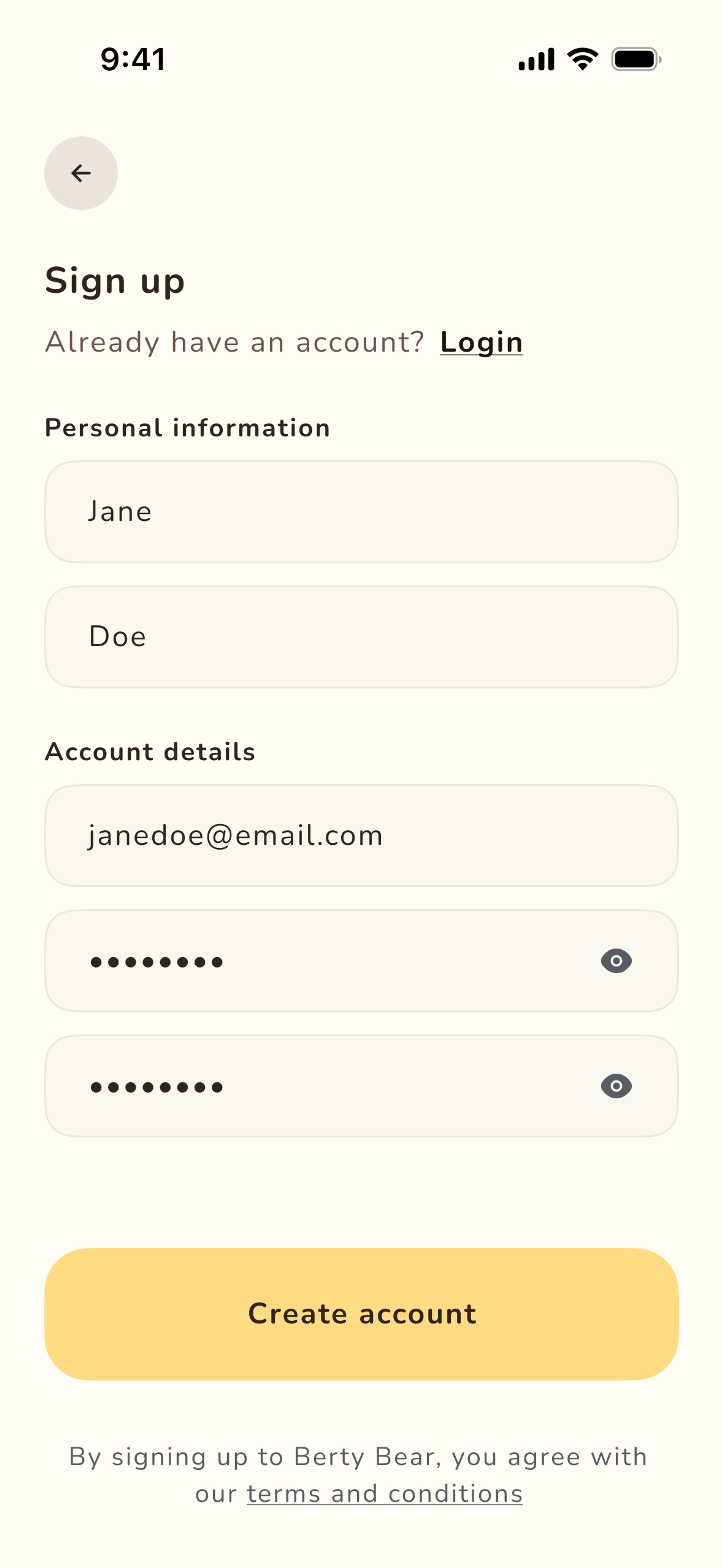
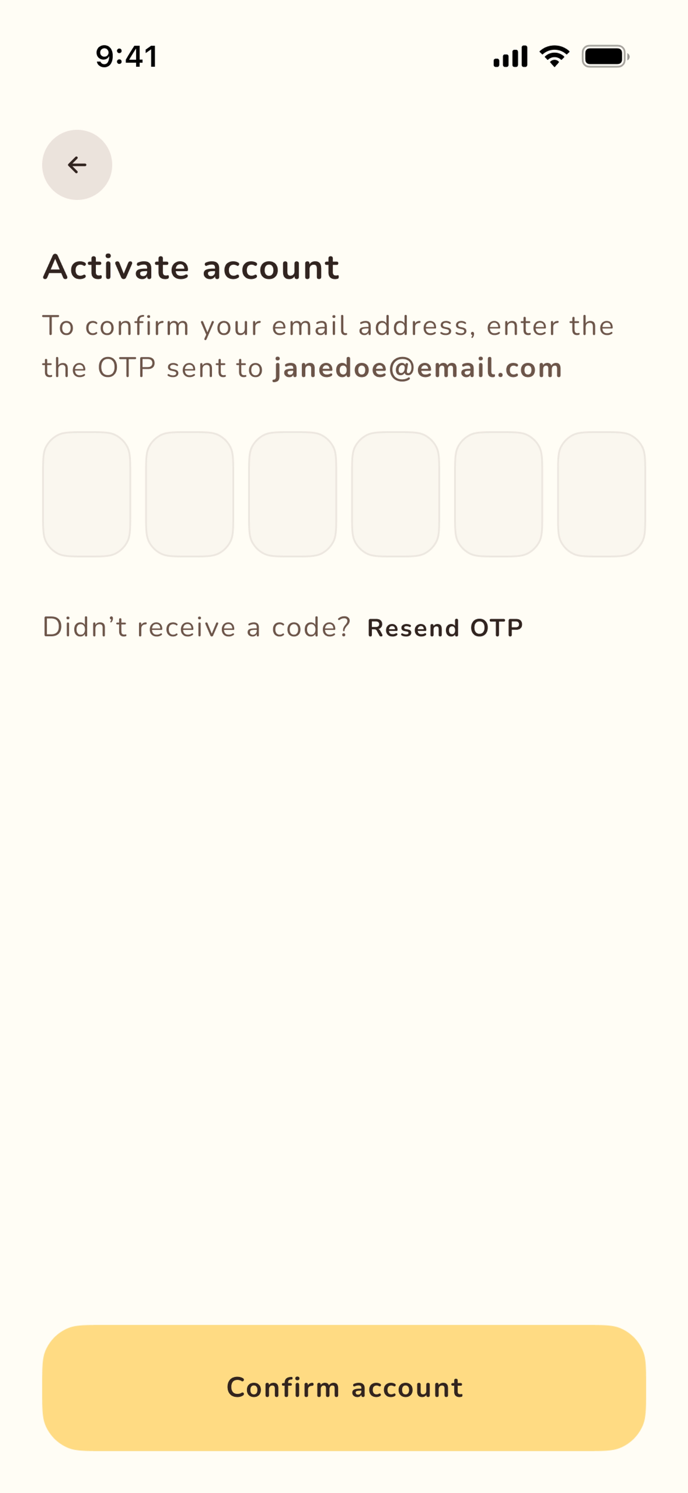
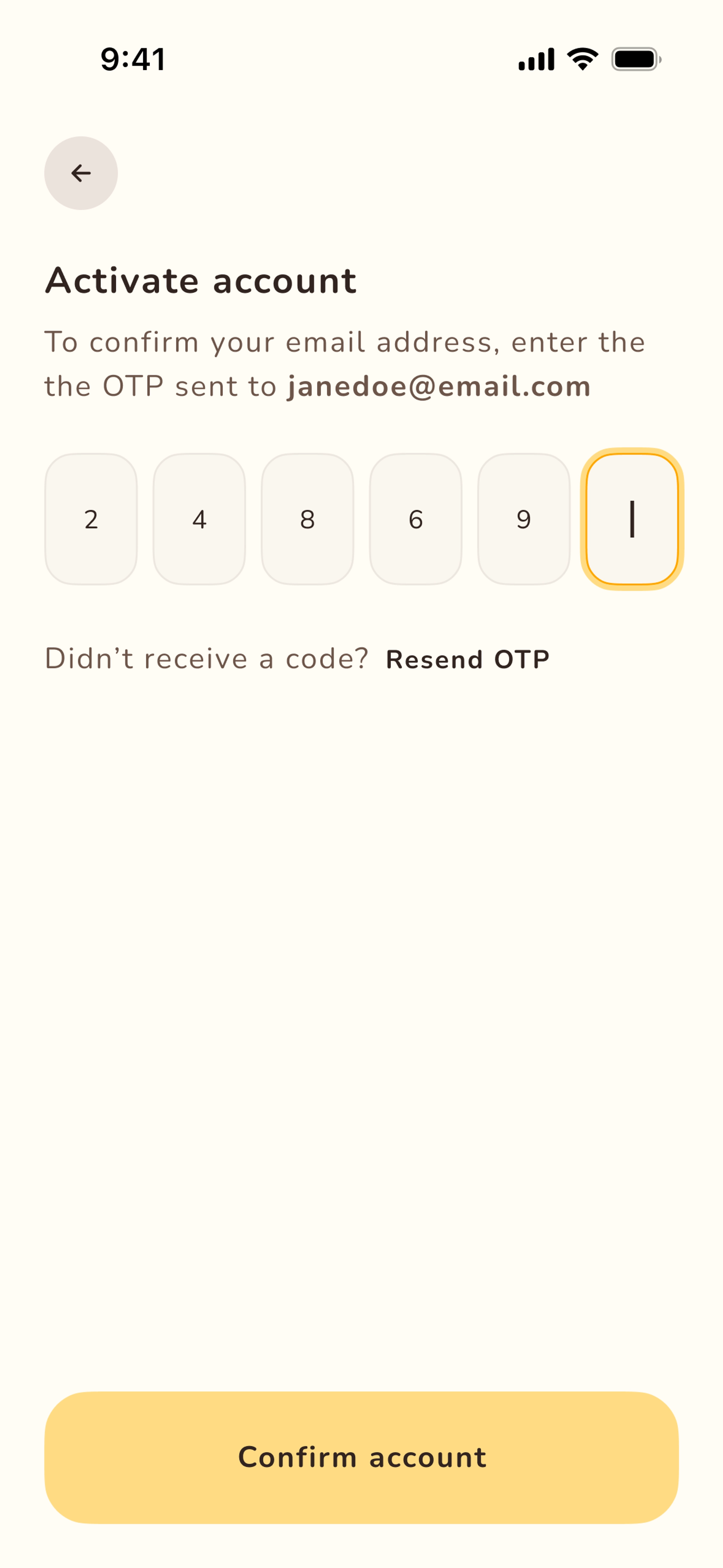
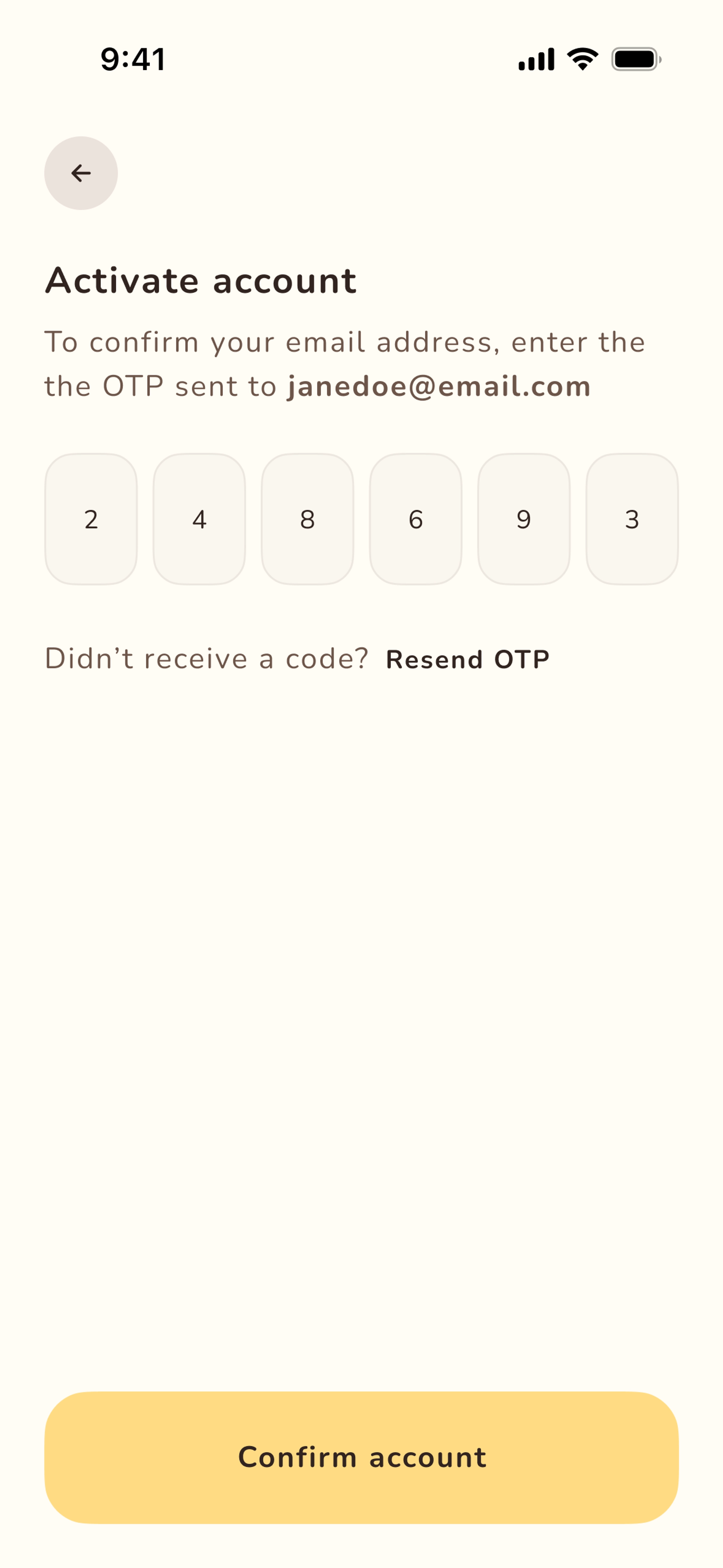
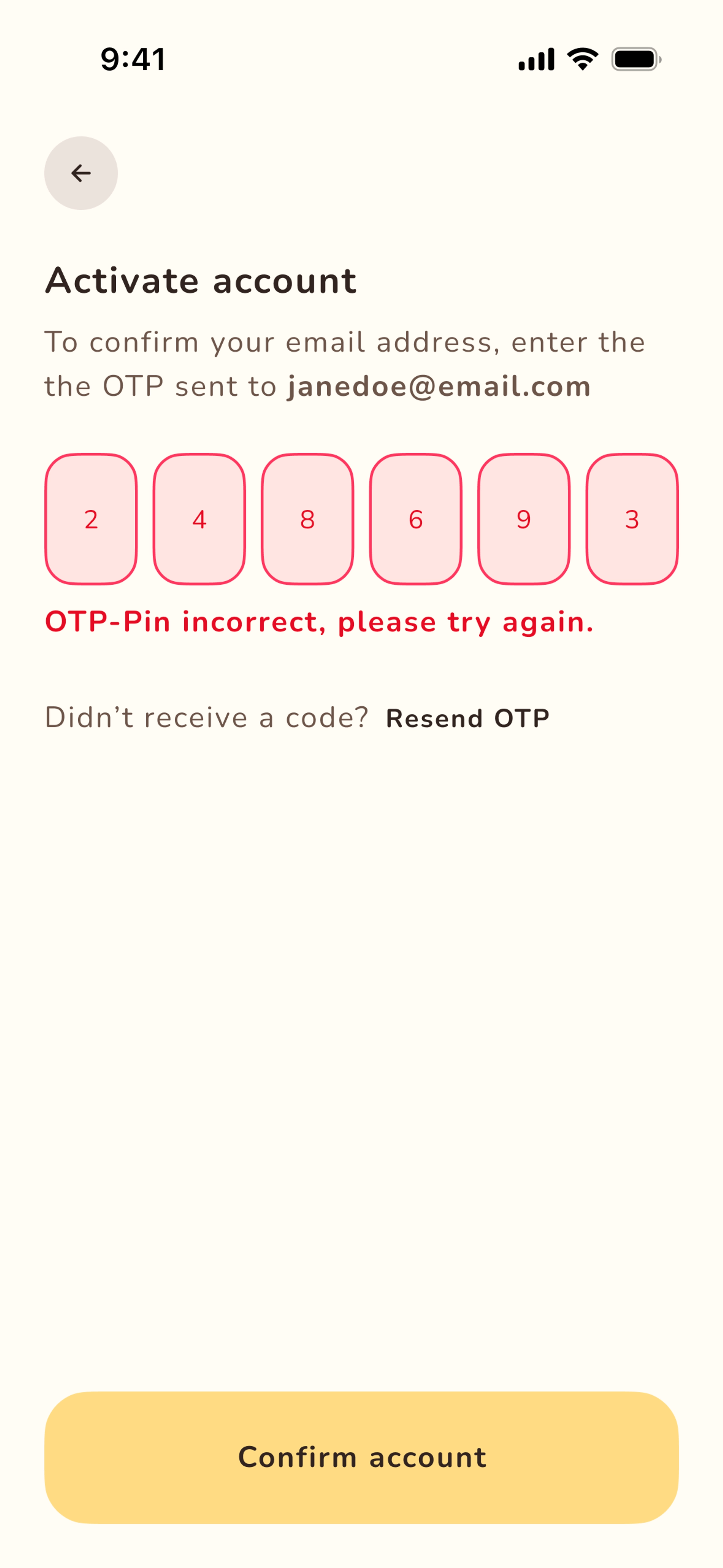
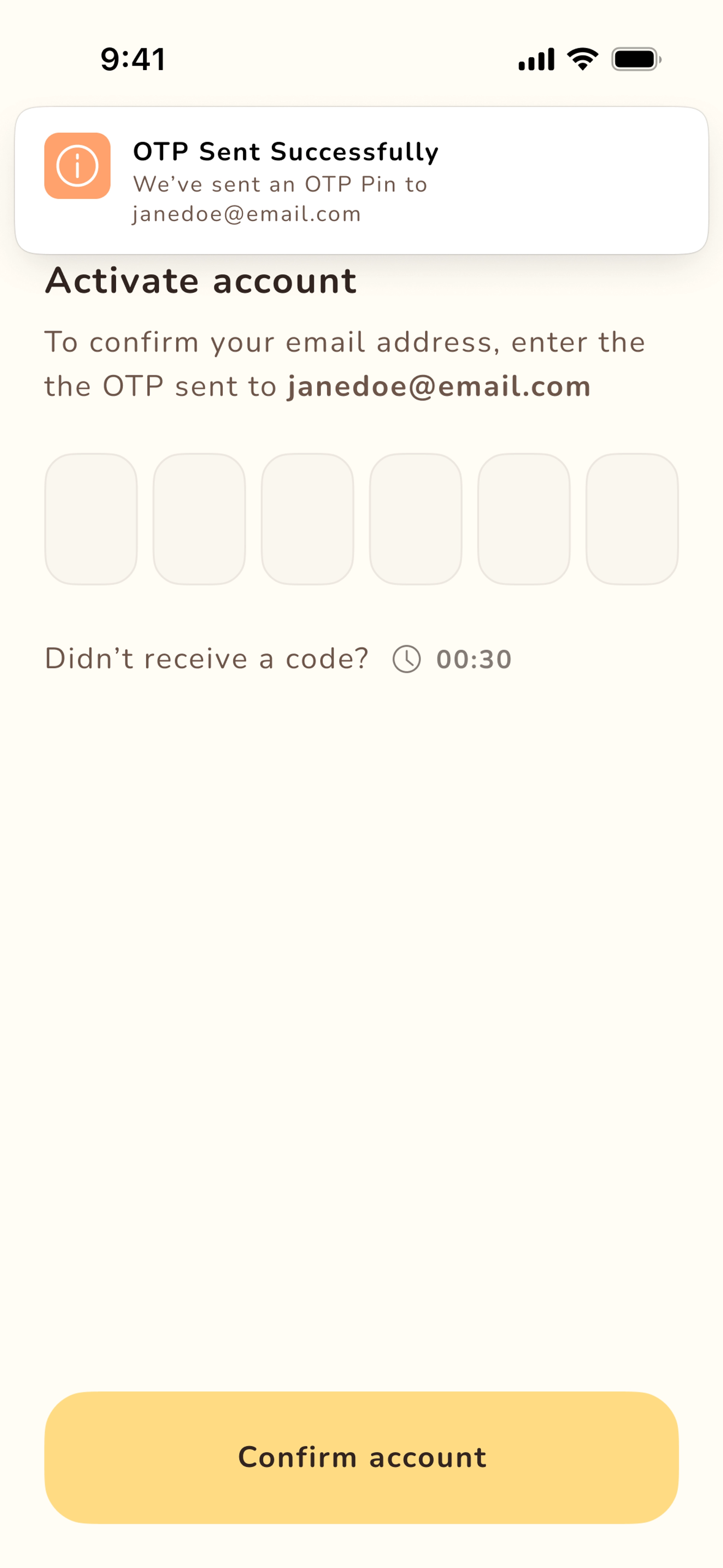
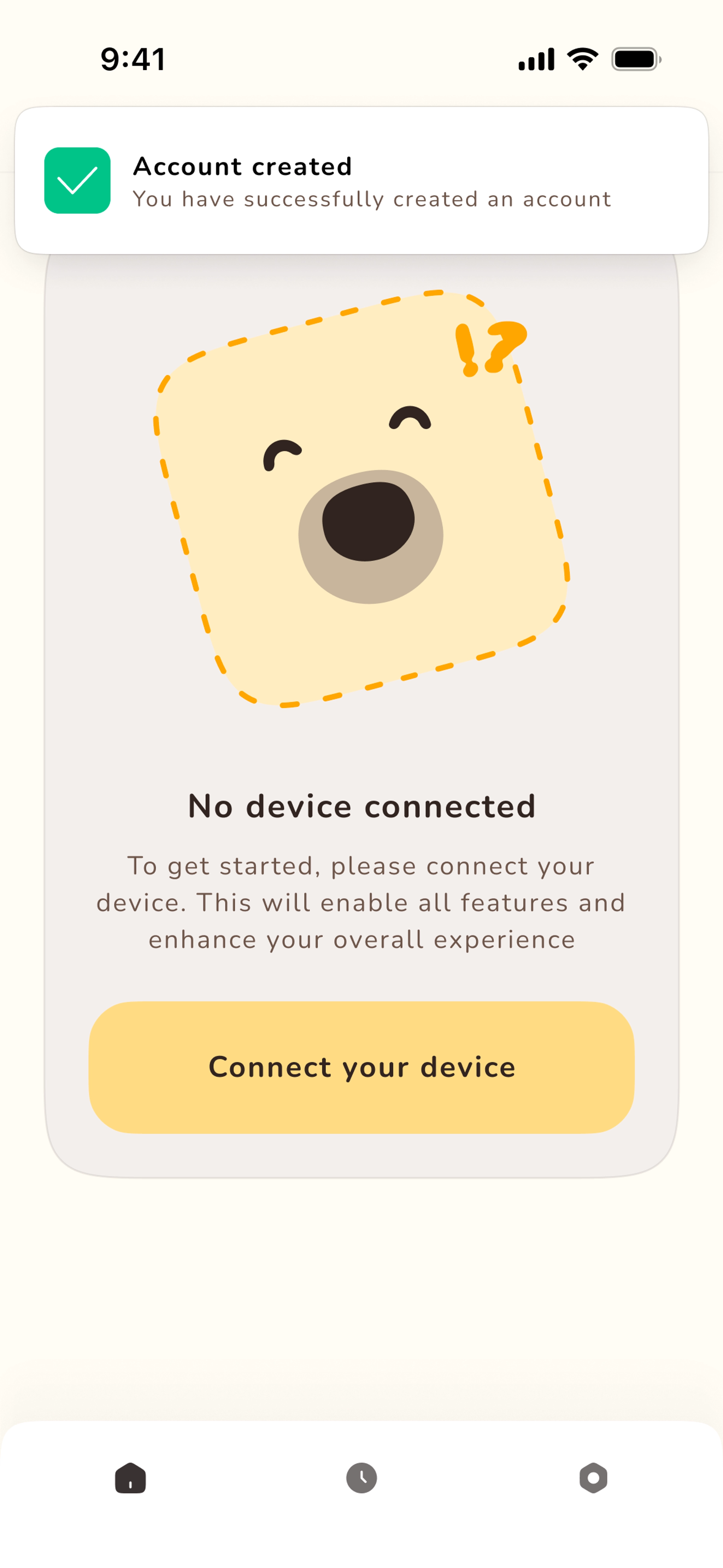
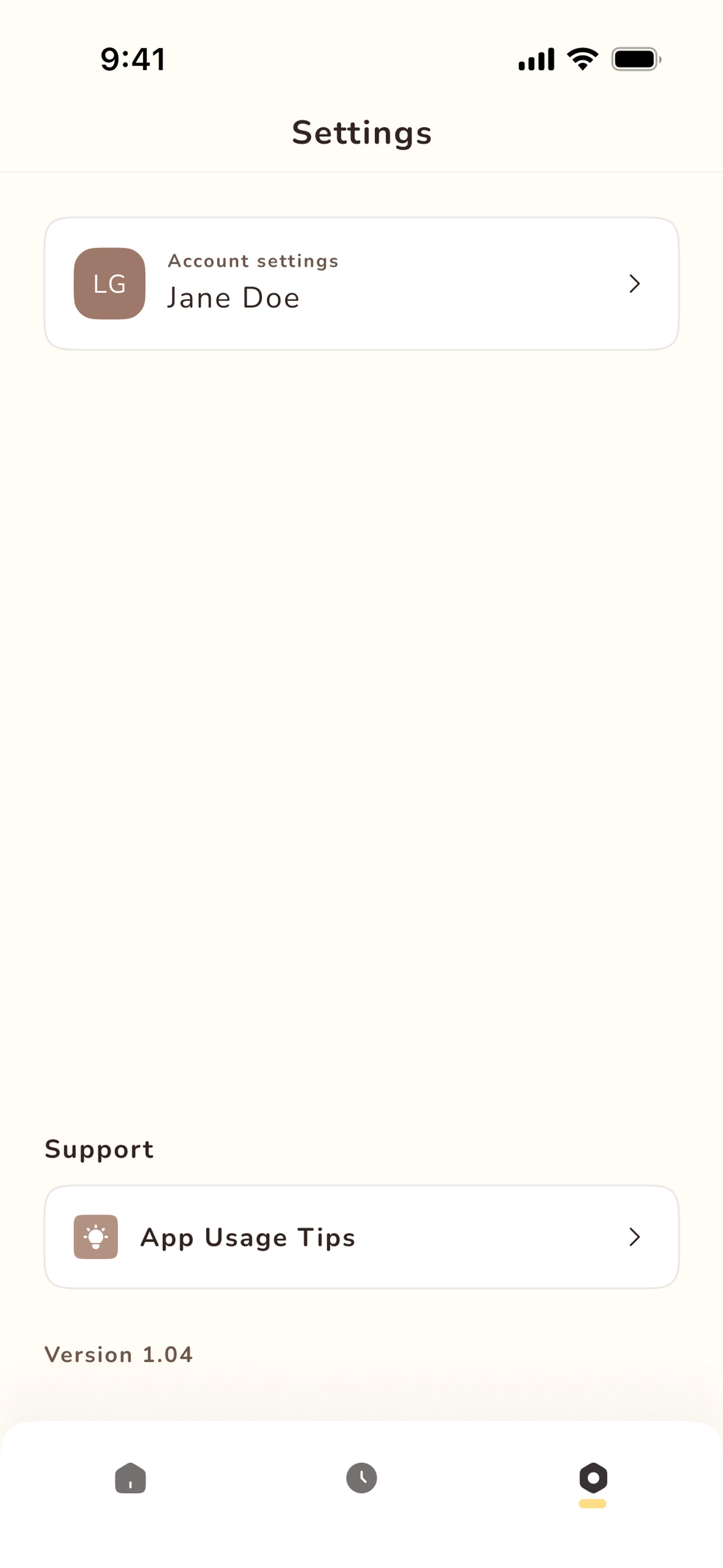
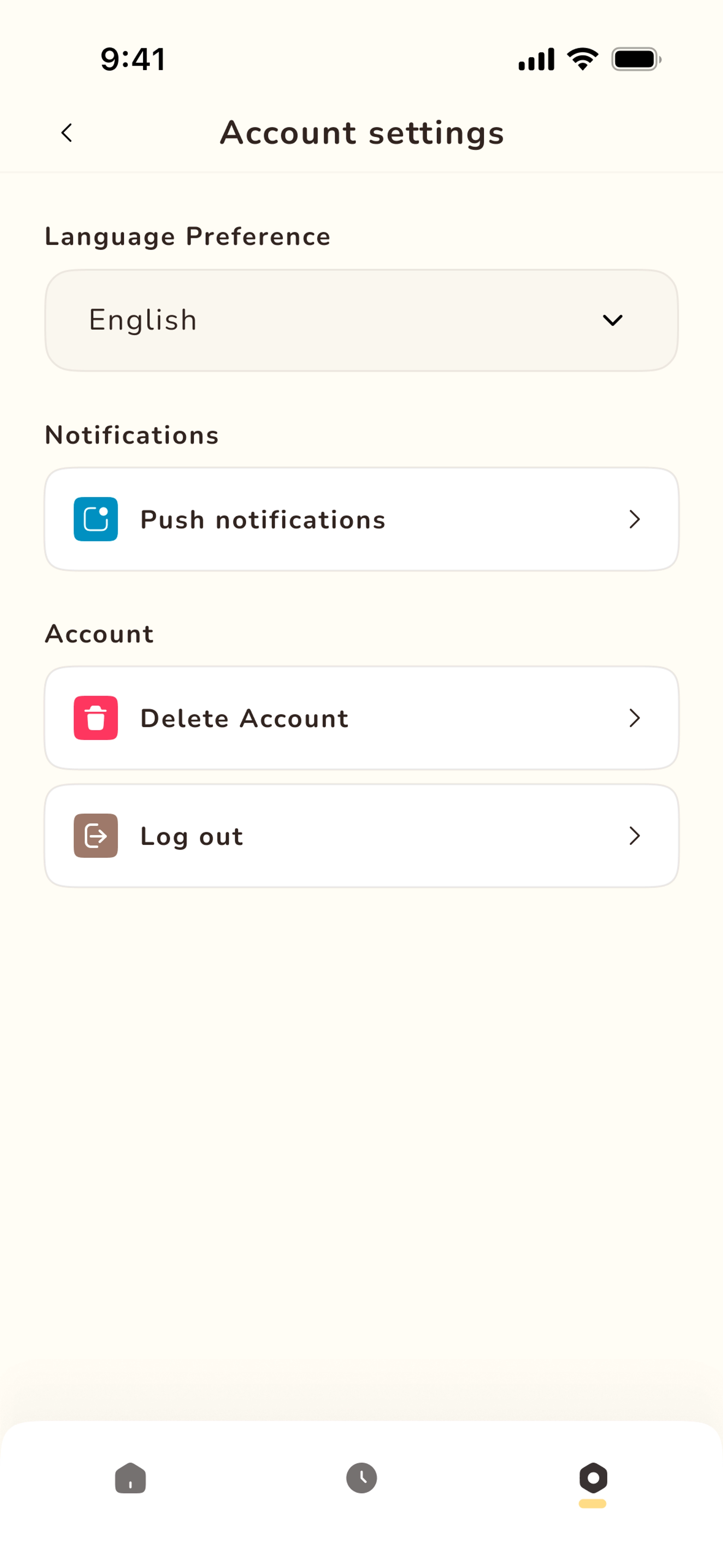
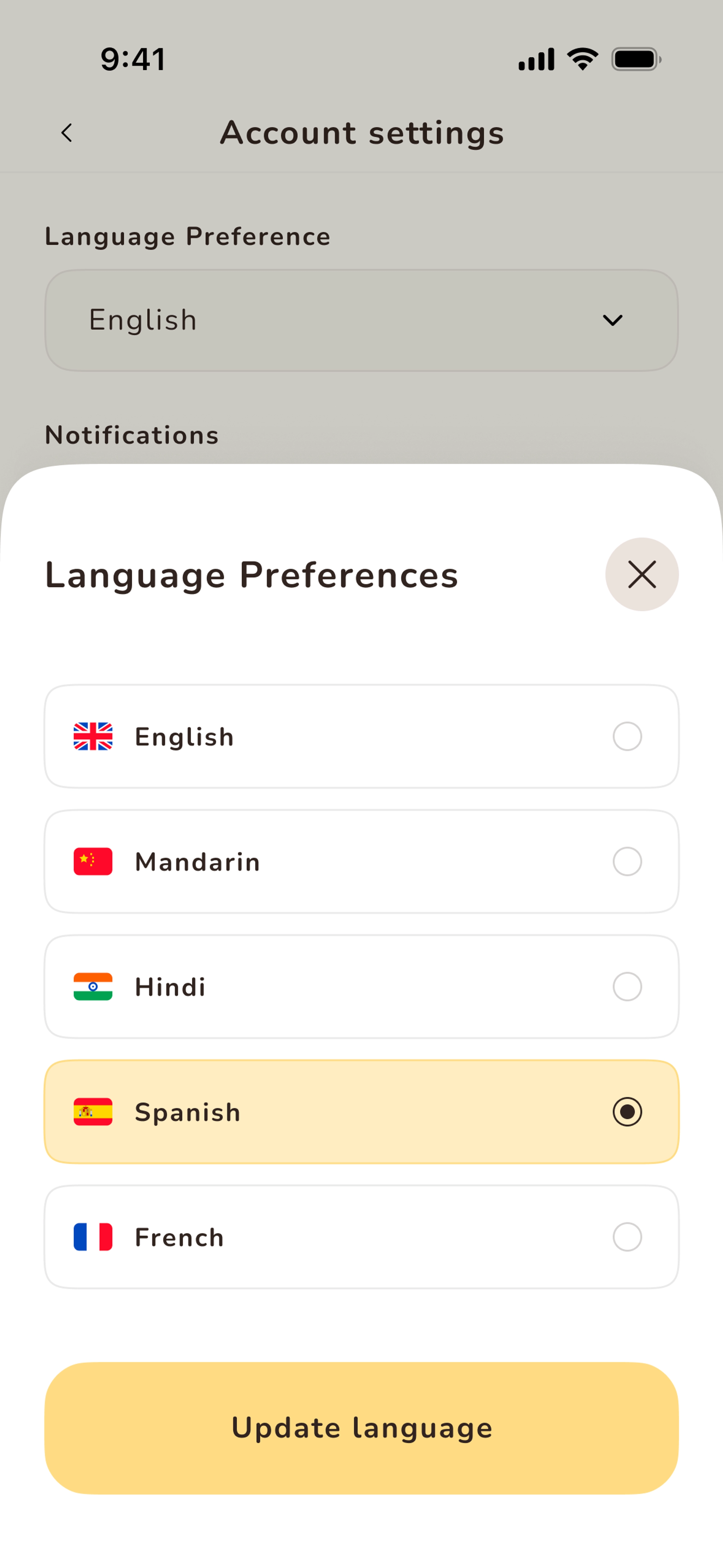
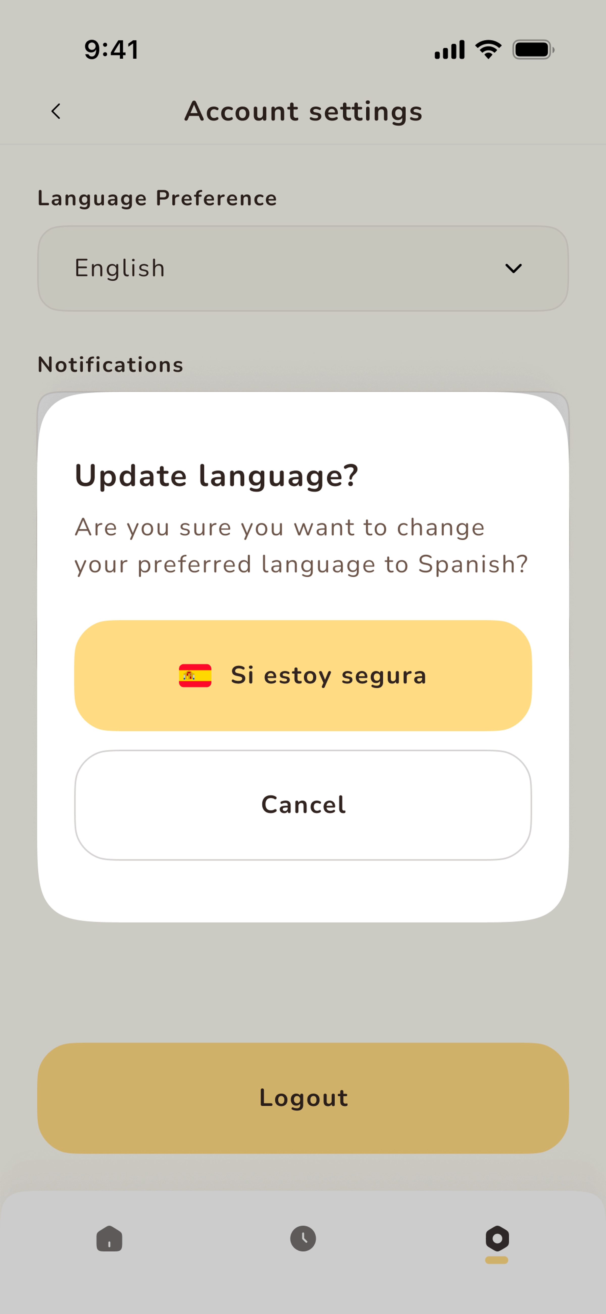
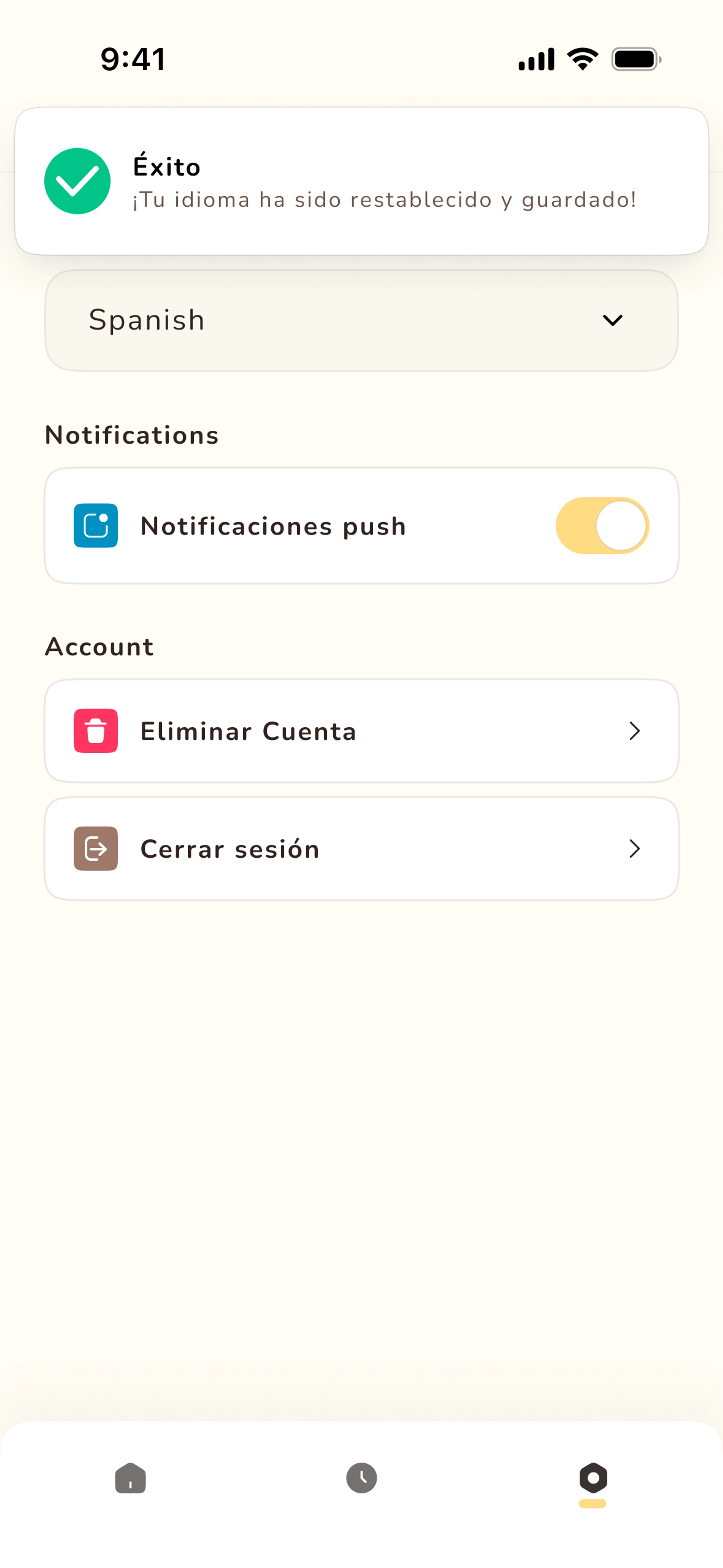
And those bright colours didn't disappear completely. I found ways to bring them back in places where they wouldn't fight for attention or overpower each other.
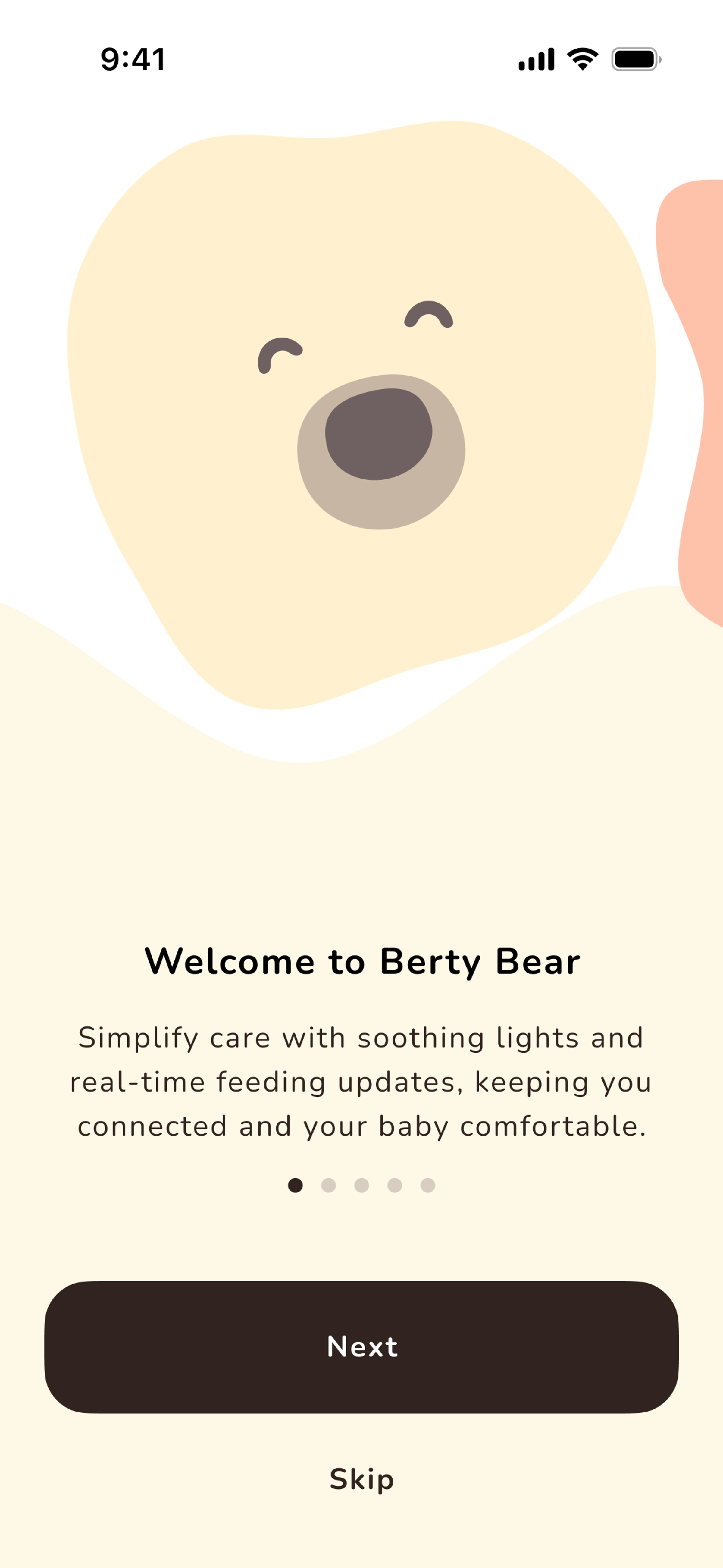
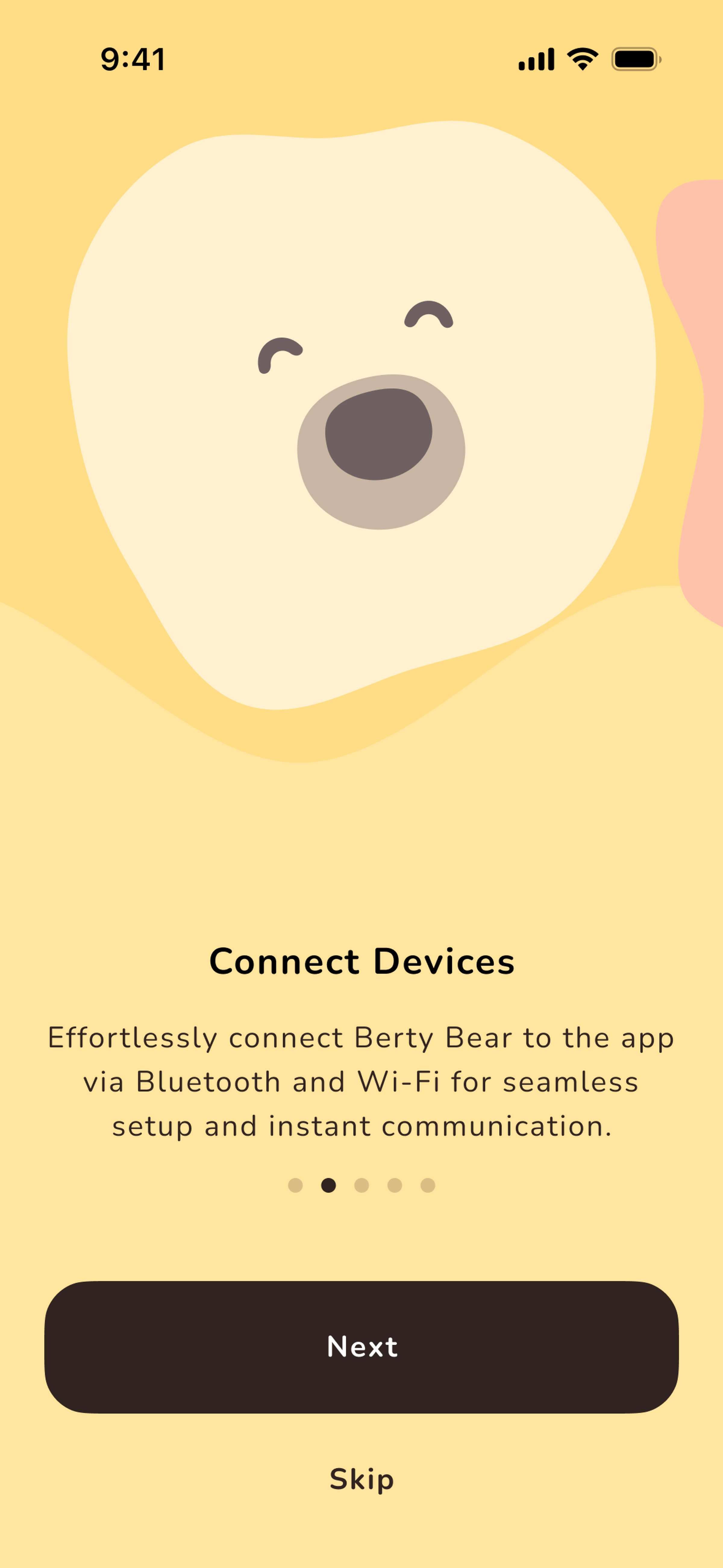
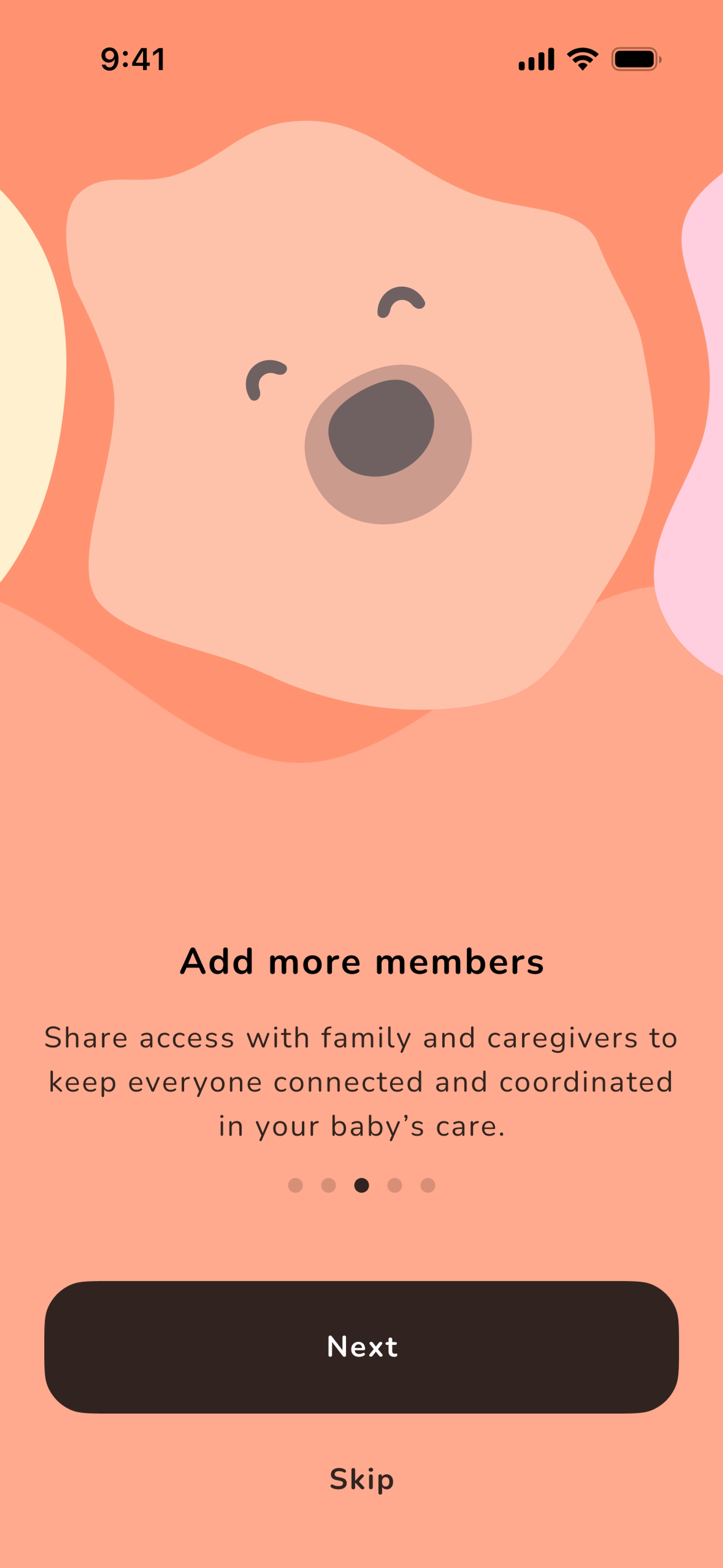
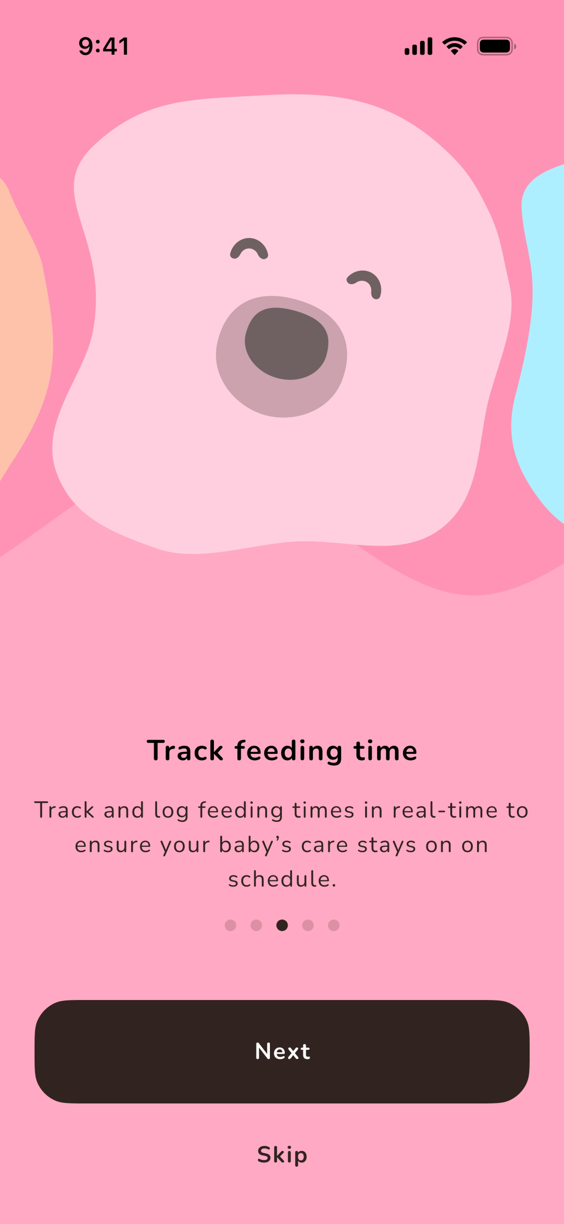
App Store Assets
App Icon
Conclusion
I walked away from this project with a few things I could carry forward.
Understanding the client is not the same as agreeing with them. The best decisions came when I stopped trying to sell a solution and started listening to what they actually valued. His wife's brand work mattered to him. Once I understood that, everything else fell into place.
Ask the right questions early on. I spent too long trying to fix the colours before asking: "What about this brand is important to you?" That question, asked sooner, would have saved us both time.
Challenge the client. You are the expert. But challenge with empathy, not ego. The honeycomb palette worked because it connected to something the client already loved: bears and honey. I did not have to tear anything down to build something better.
And patience. Lots of it. Creative work under constraint is a slow negotiation, not a sprint. The solution was never going to arrive in a single flash of inspiration. It came in layers: reject, adjust, propose, listen, adjust again.
Also, I took up smoking again.